The Metamorphosis Brand Identity
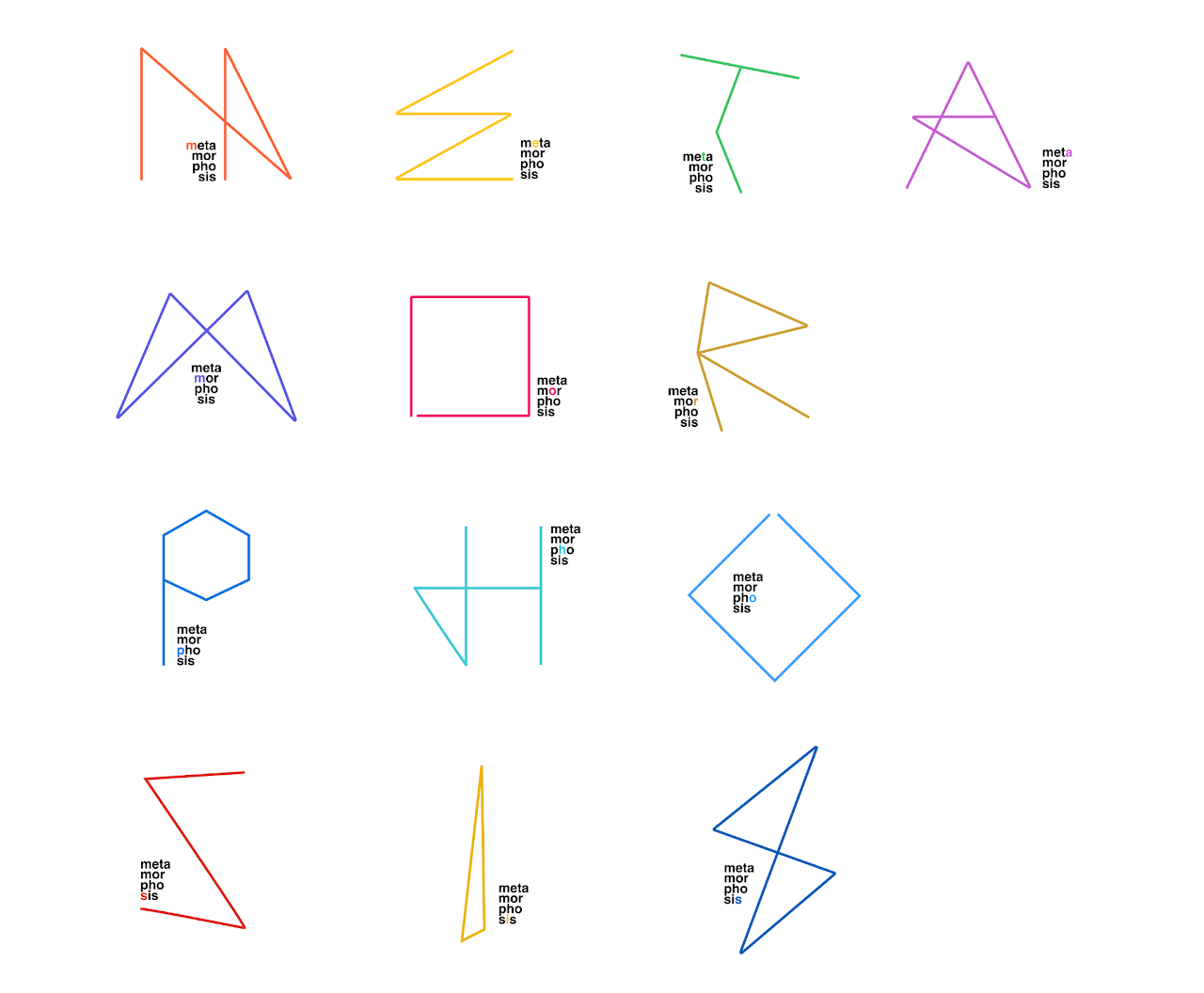
This is a branding study I presented for the Workday Design Week 2022 event. The Metamorphosis theme allowed for so much interpretation and exploration. My favorite design was the animated font symbolizing the morphing from one state to the next.
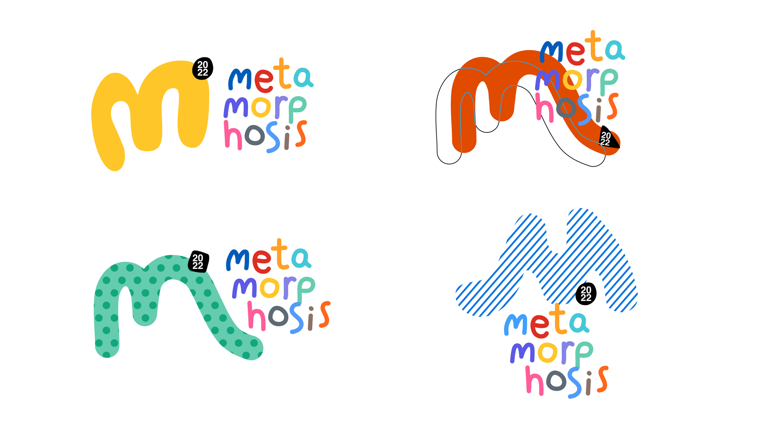
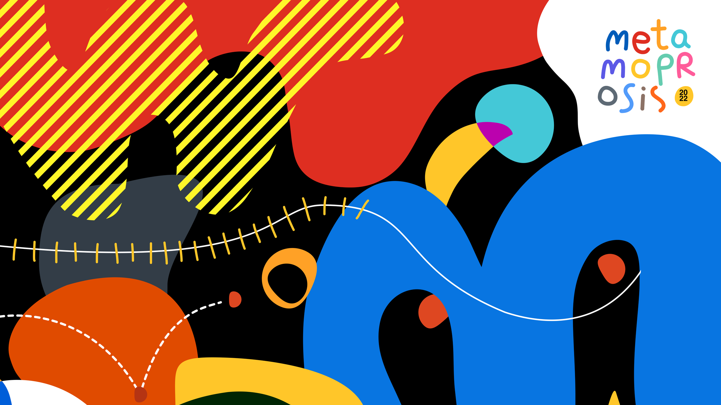
The second concept was a more organic and abstract interpretation of the wormy shape of the M morphing into the bright colored abstract world.
Unfortunately these were not the chosen identity for the project, but I had a great time working on them.
——
.gif animation by Ben Rowles