

Case Study:
Shichi, the Power of 7
Client: Shichi - Japanese Restaurant, Bangkok Thailand
Role: Creative Director/Visual Design Lead
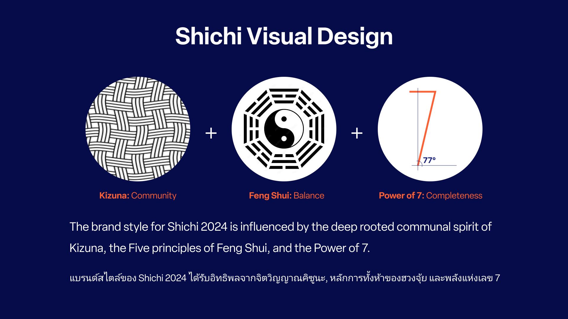
While Shichi expanded into a multi-concept success, its visual identity remained a collection of parts rather than a whole. In a Thai market often defined by aesthetic mimicry, we sought a radical shift toward authenticity. By anchoring the rebrand in the Power of 7 (Shichi) and Feng Shui, we built a balanced, premium system designed to stand alone in a sea of industry clones.
“Shichi had quickly scaled from a single suburban destination into a sprawling operation without a grounding vision. My goal was to give Shichi a single voice and a visual aesthetic that set it apart from the repetitive landscape of the greater Bangkok area.”

The Heart
To align Shichi’s diverse portfolio we established Kizuna (the spirit of connection) as our strategic voice. This narrative acted as a filter for every touchpoint, replacing generic restaurant marketing with intentional, editorial storytelling. We moved the brand away from the "me-too" cycle and toward a cohesive, human-centered destination.
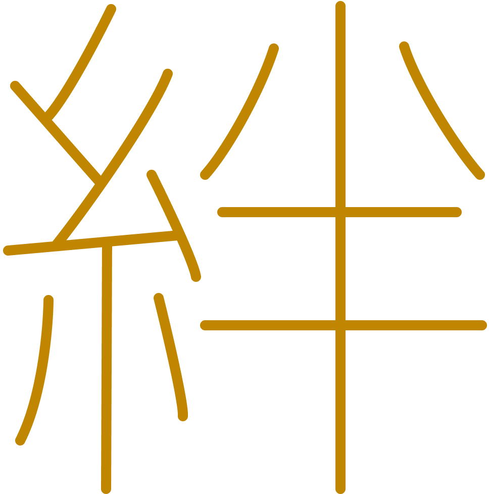
The kanji 絆 is made up of two parts: the kanji 糸 (ito), which means "thread," and the kanji 心 (kokoro), which means "heart." This suggests that the bond between people is only as strong as the thread that binds them together.
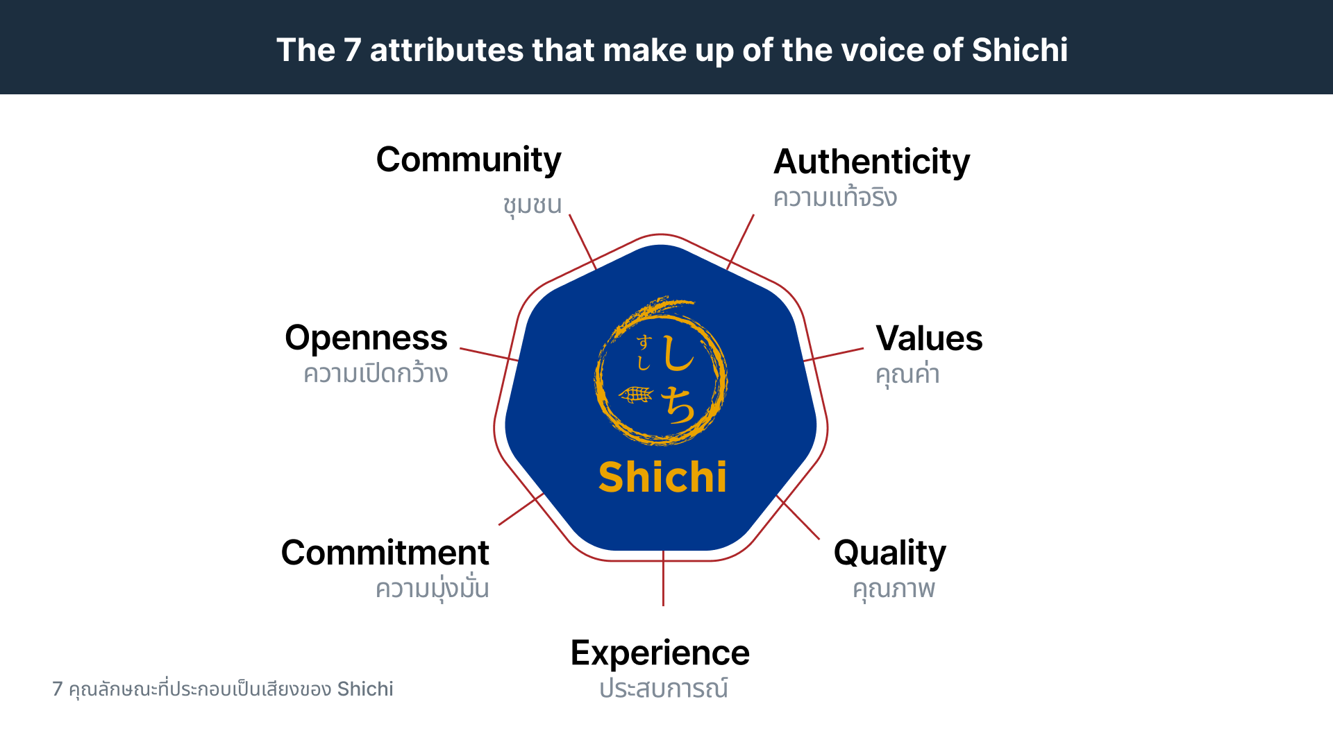

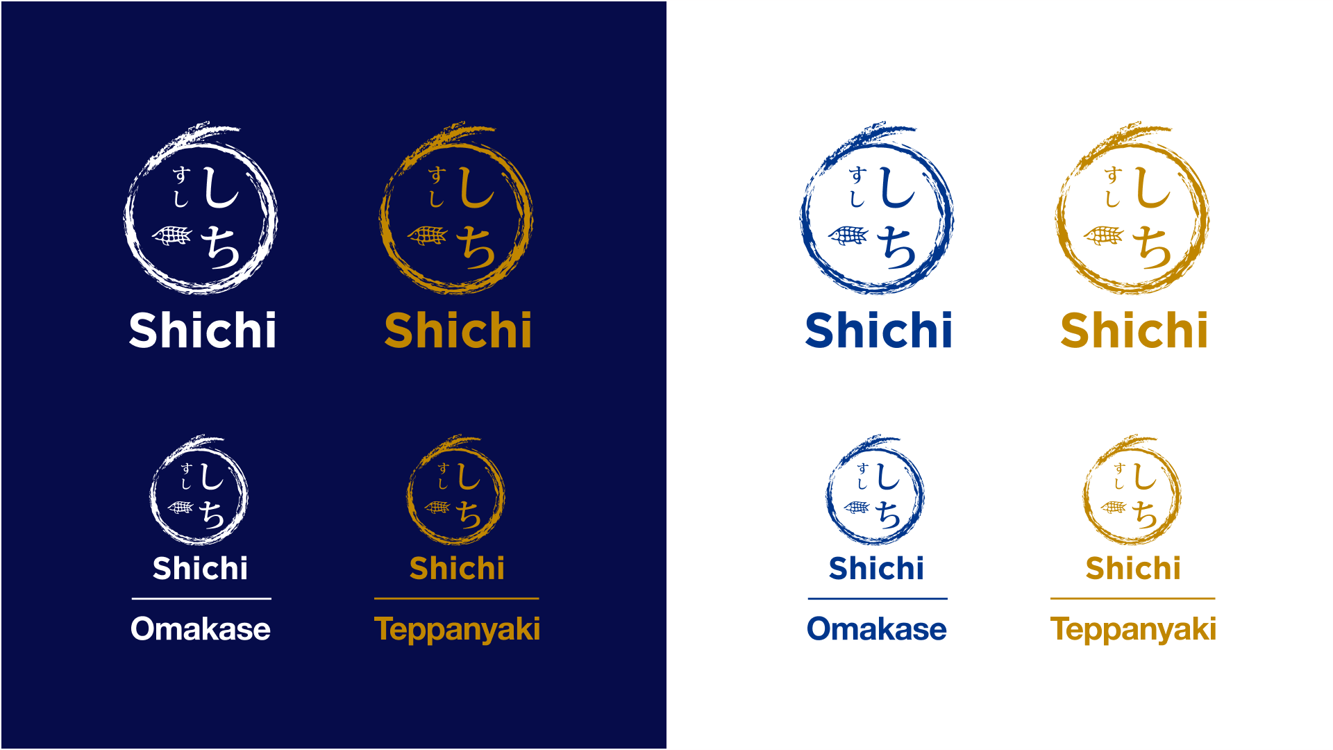
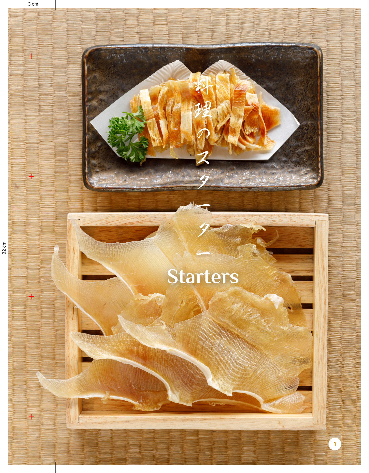
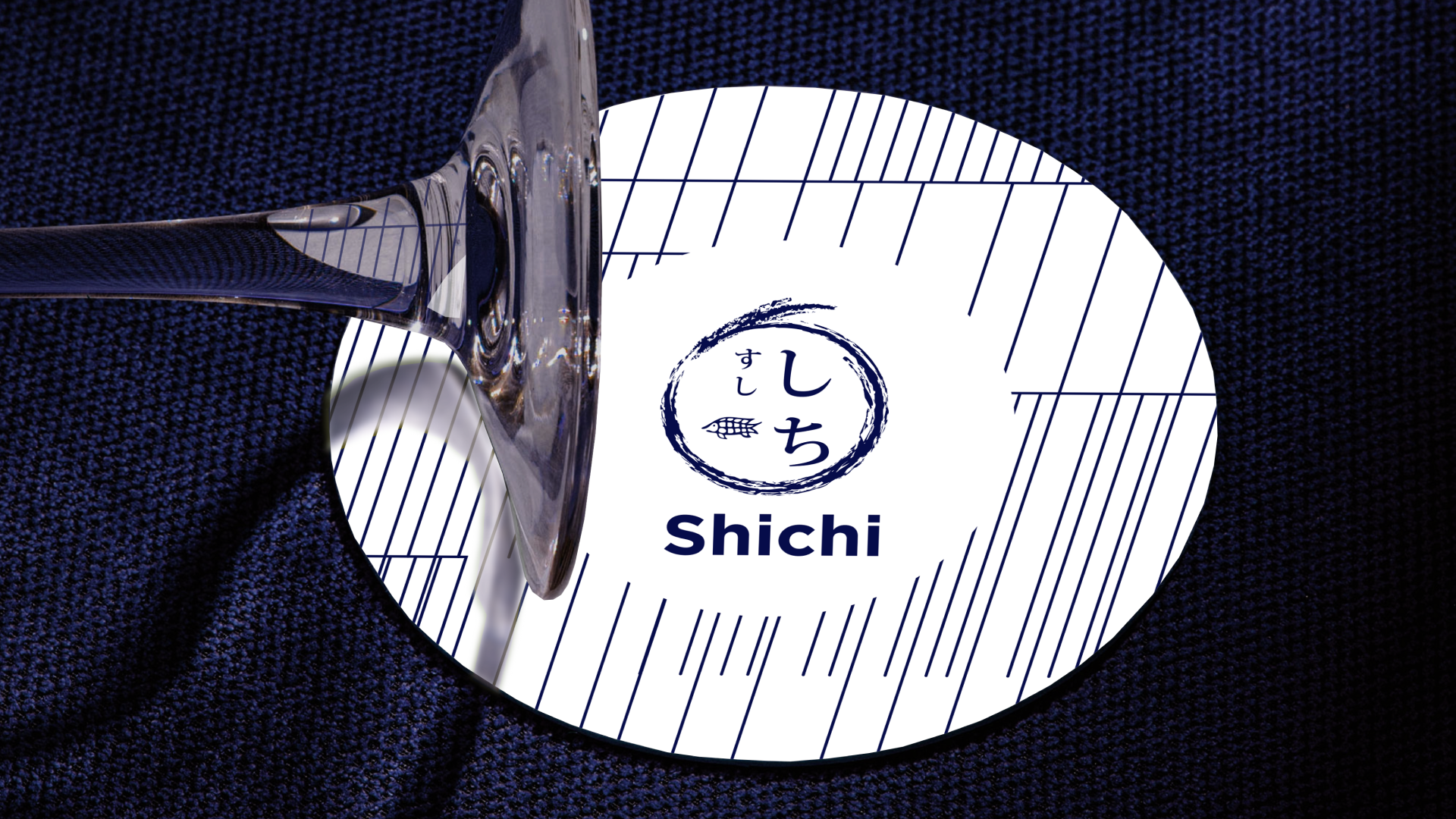
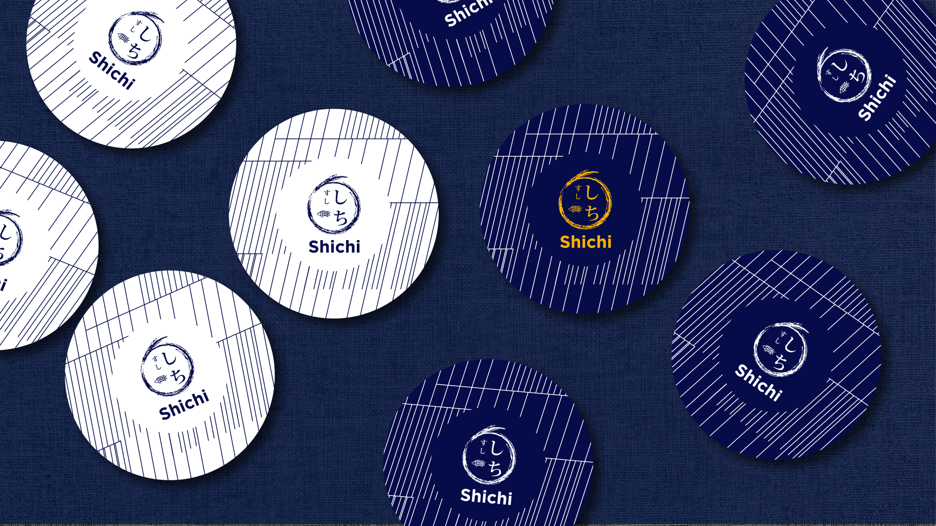
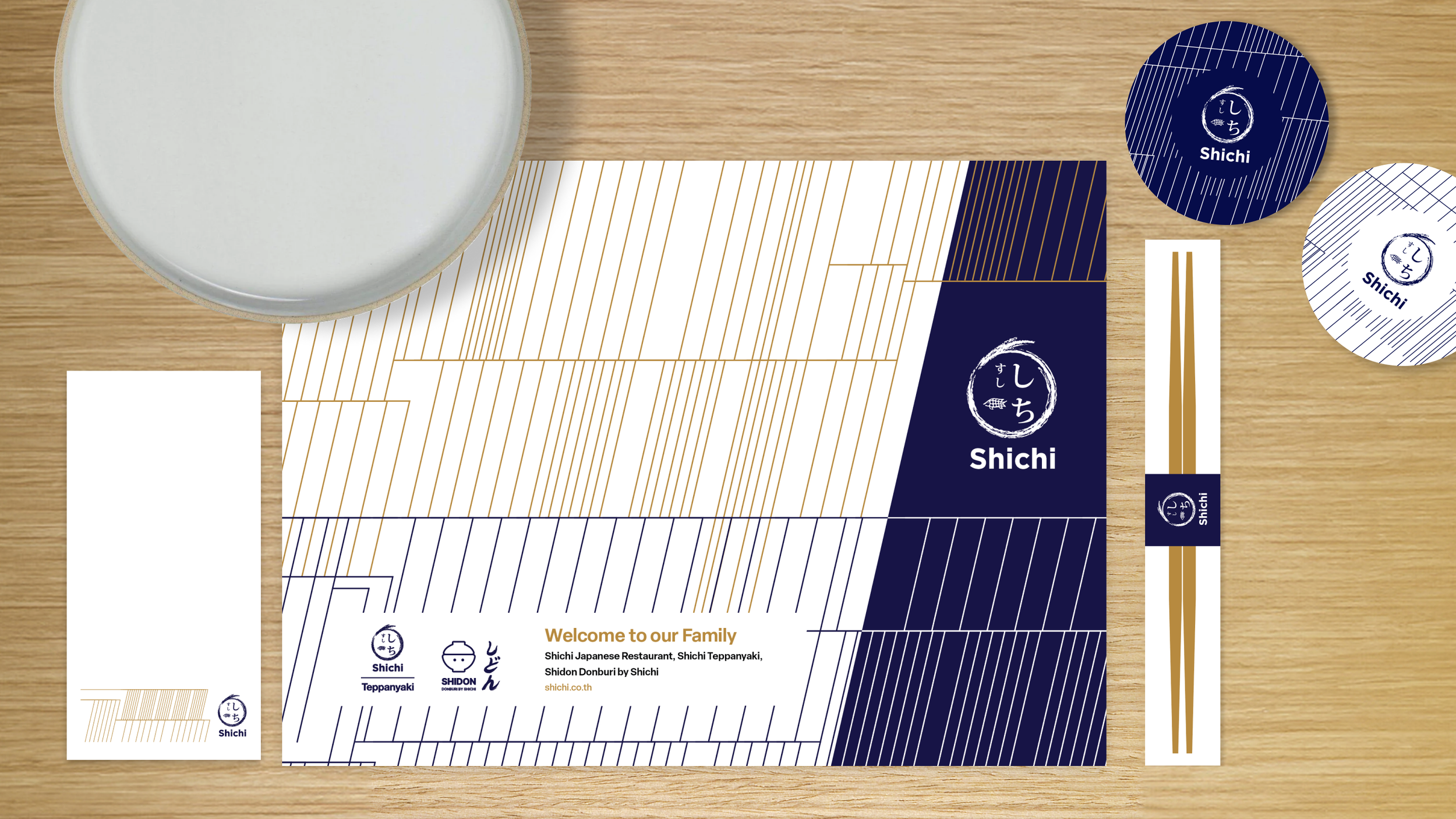
The Pattern Library
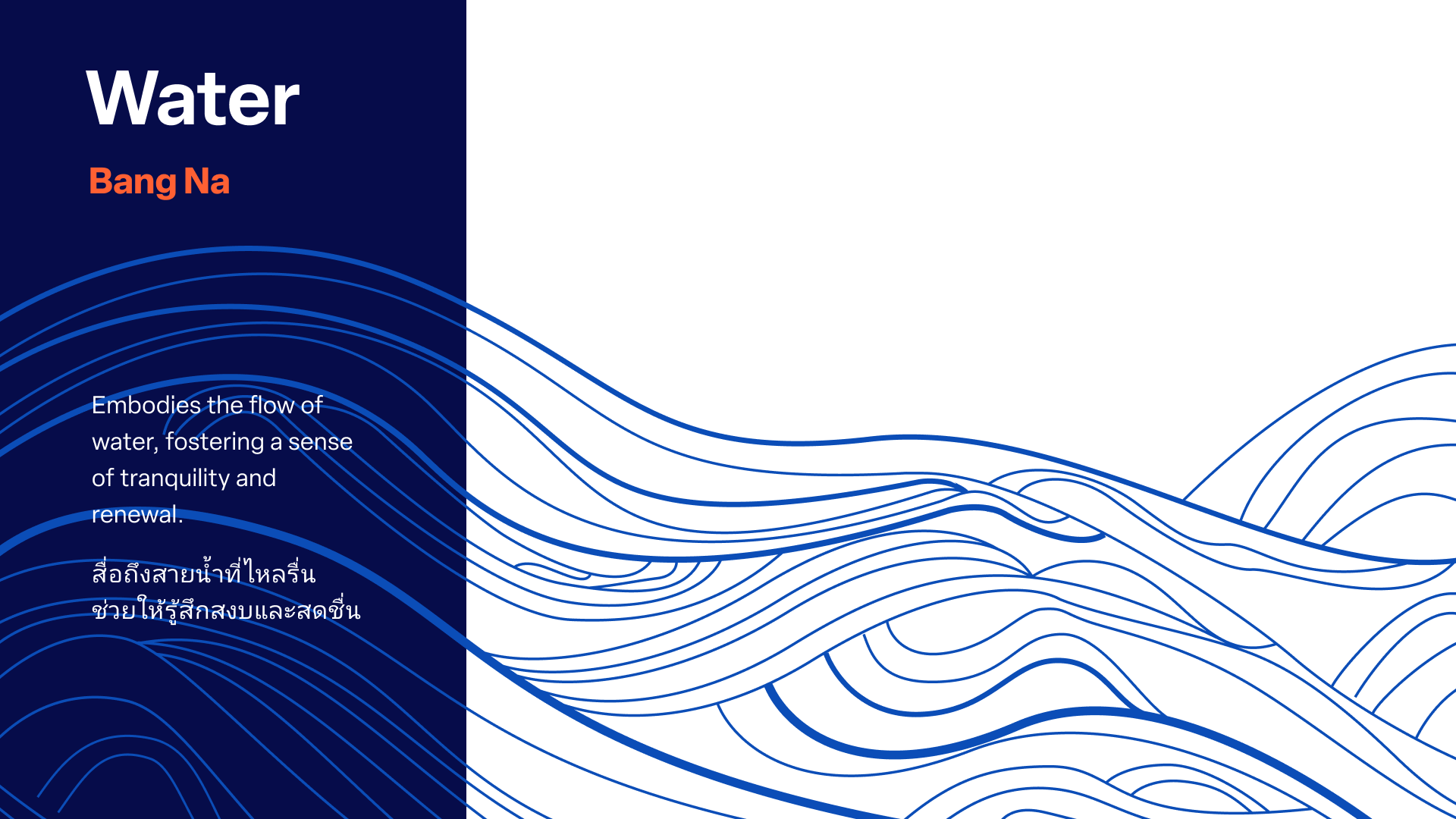
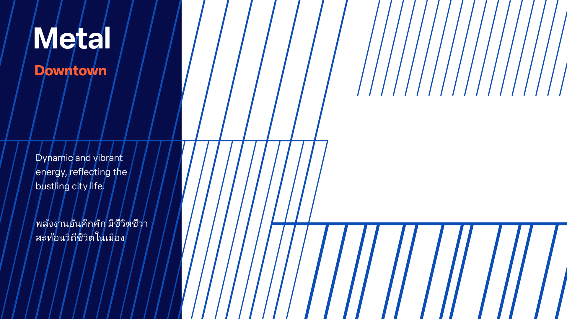
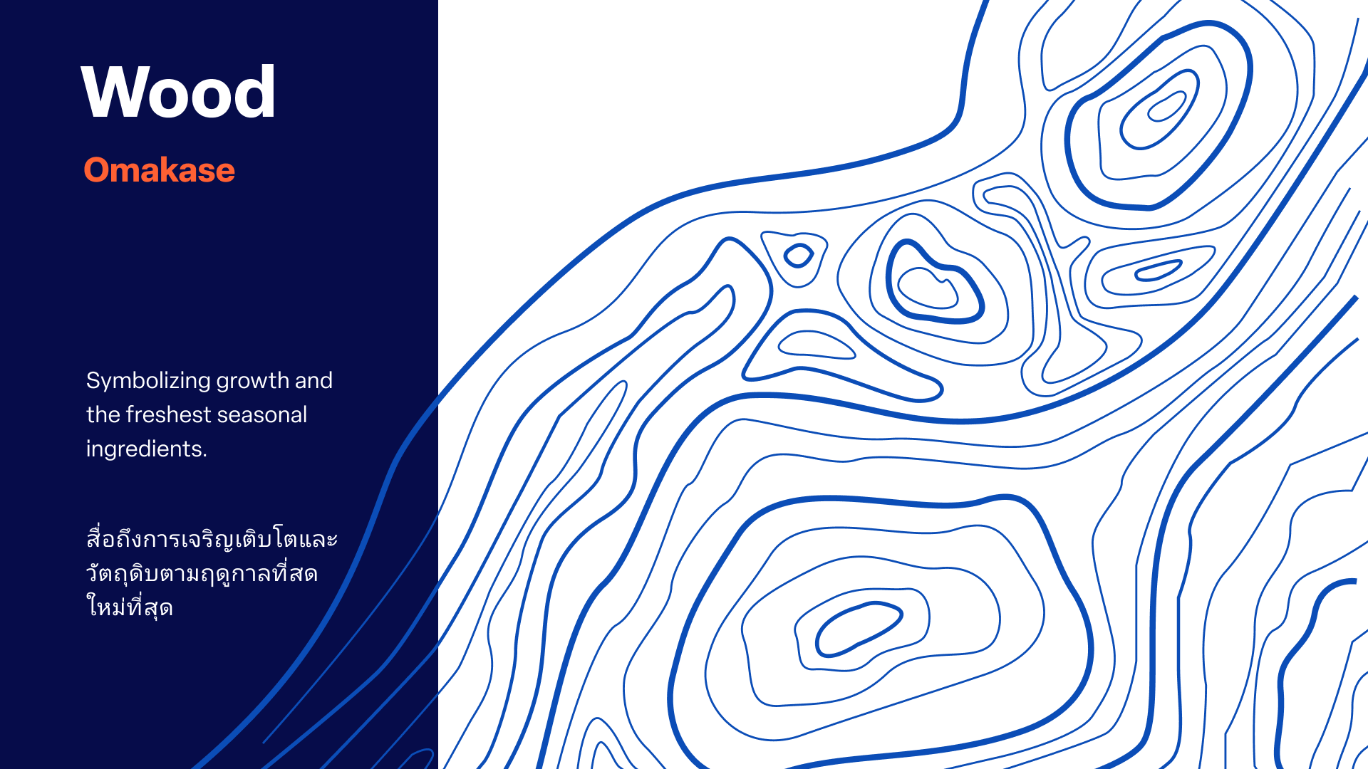
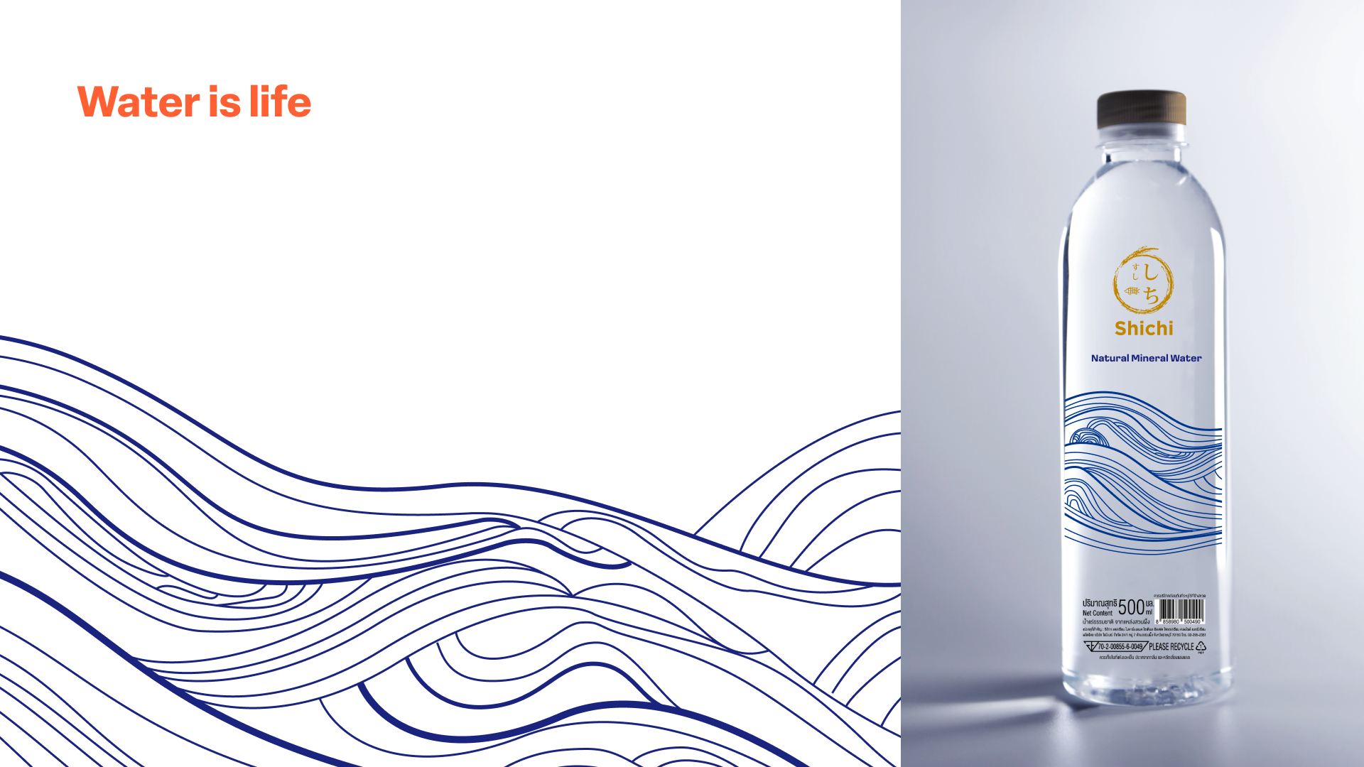
The visual DNA is expressed through a series of custom motifs. We reinterpreted traditional Ryusui (flowing water) patterns to represent the elements of Water, Earth, Wood and Fire.
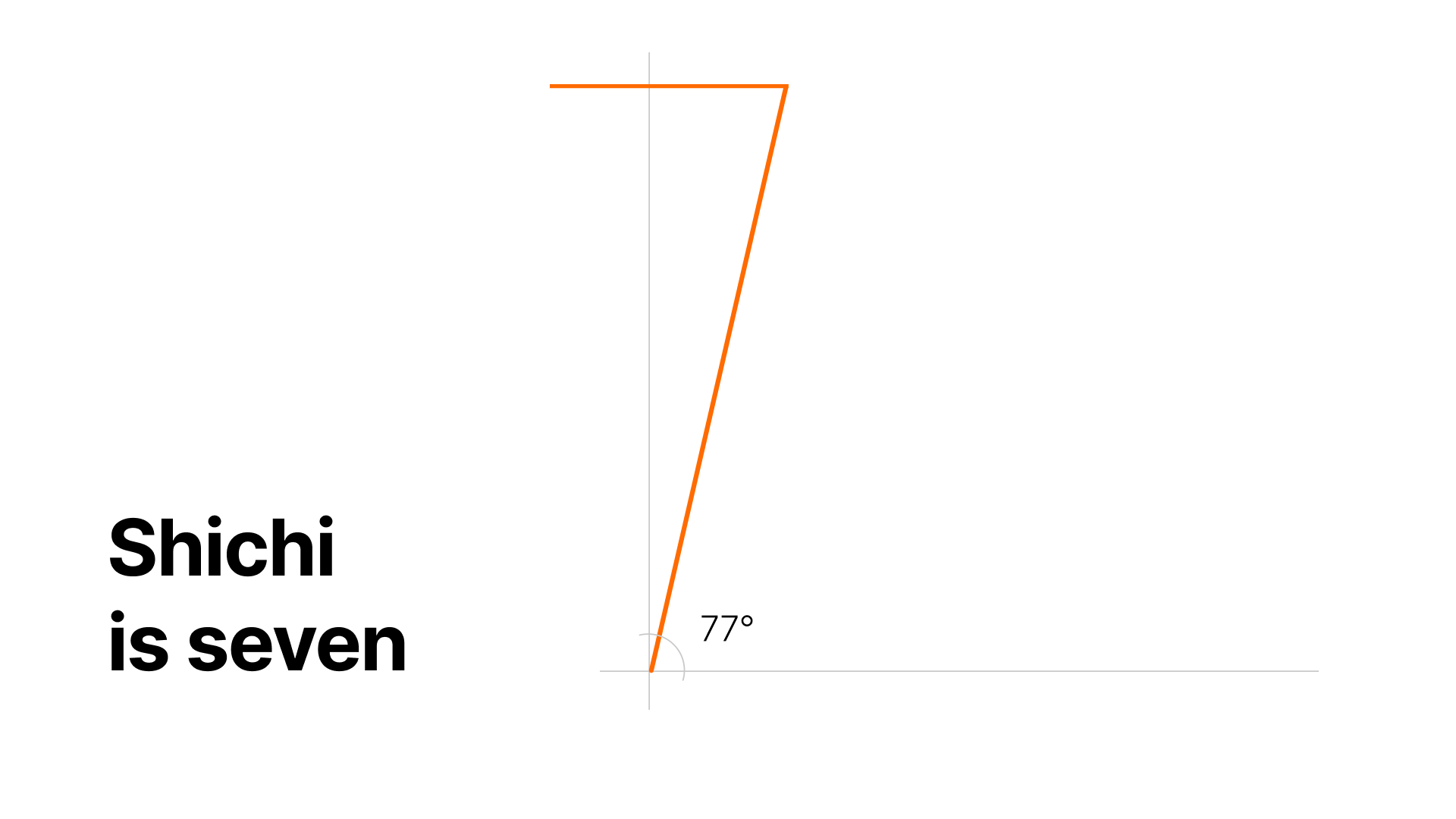
These are anchored by the "7" pattern, a geometric abstraction of the brand’s namesake that signifies completeness and serves as a quiet signature across all touchpoints.
"I love a hidden detail. The '7' pattern was inspired by the brand name Shichi which translates to the number 7 in Japanese and holds a strong significance to the owners. It’s subtle but has been accepted as the core brand pattern.”


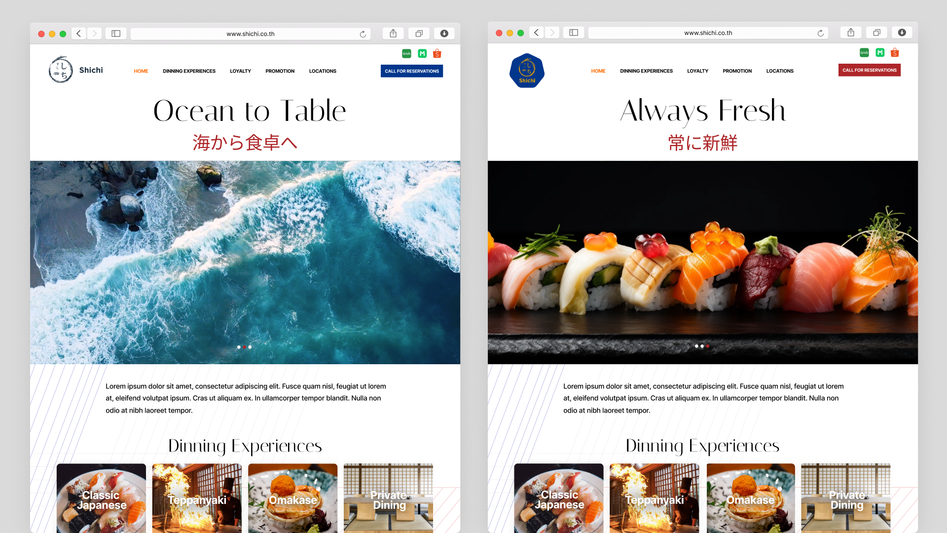
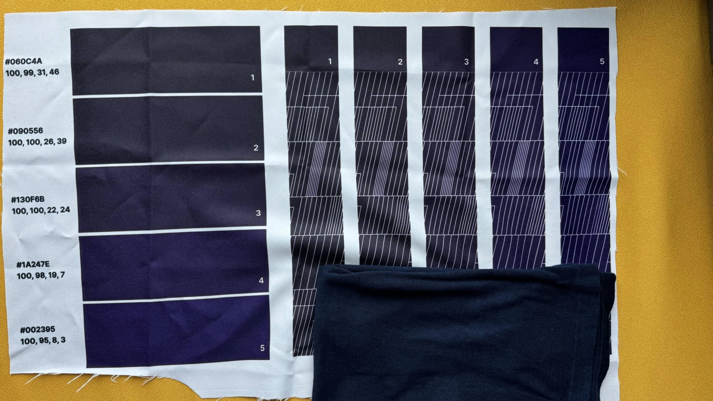
Indigo is The New Black
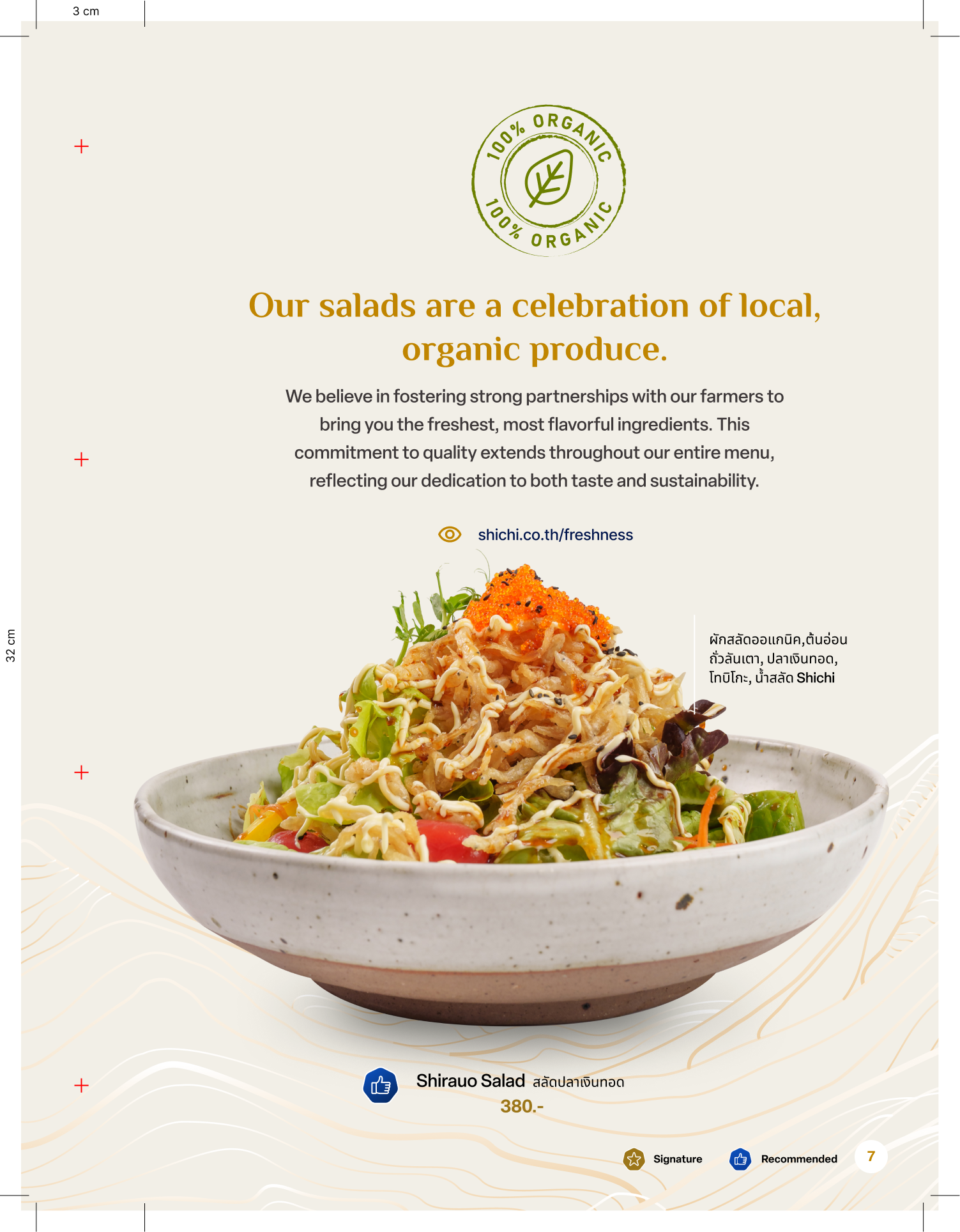
To differentiate from the industry's reliance on red and black clichés, we centered the brand on Indigo and Gold. This pairing signals quality and tradition without the visual weight of dark backgrounds. Grounded by earthy secondary tones Stone, Wood, and Salmon the liberal use of white space achieves a modern, design-magazine aesthetic.
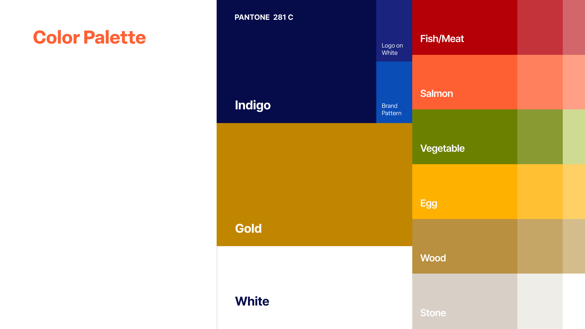
“The Shichi demographic was starting to stagnate and to reach a younger more design centric consumer, I chose to go with a modern interpretive palette with lots of whitespace to reach that new audience.”
The Transformation
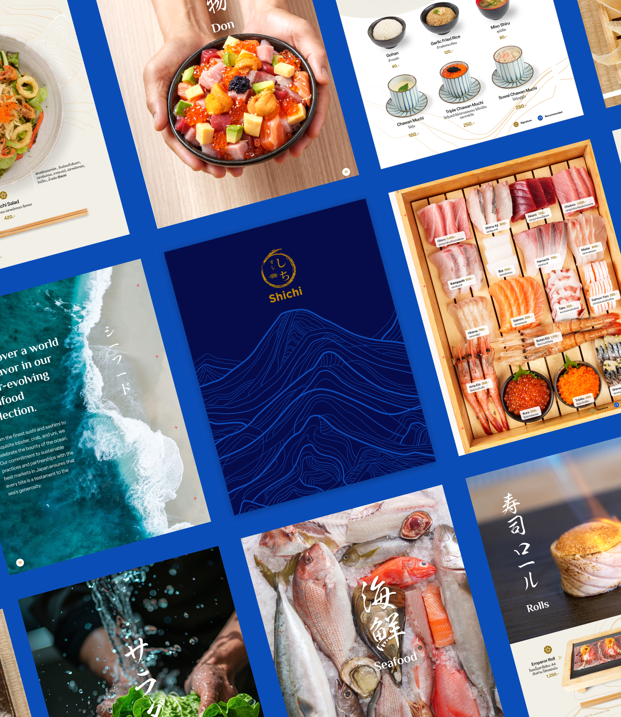
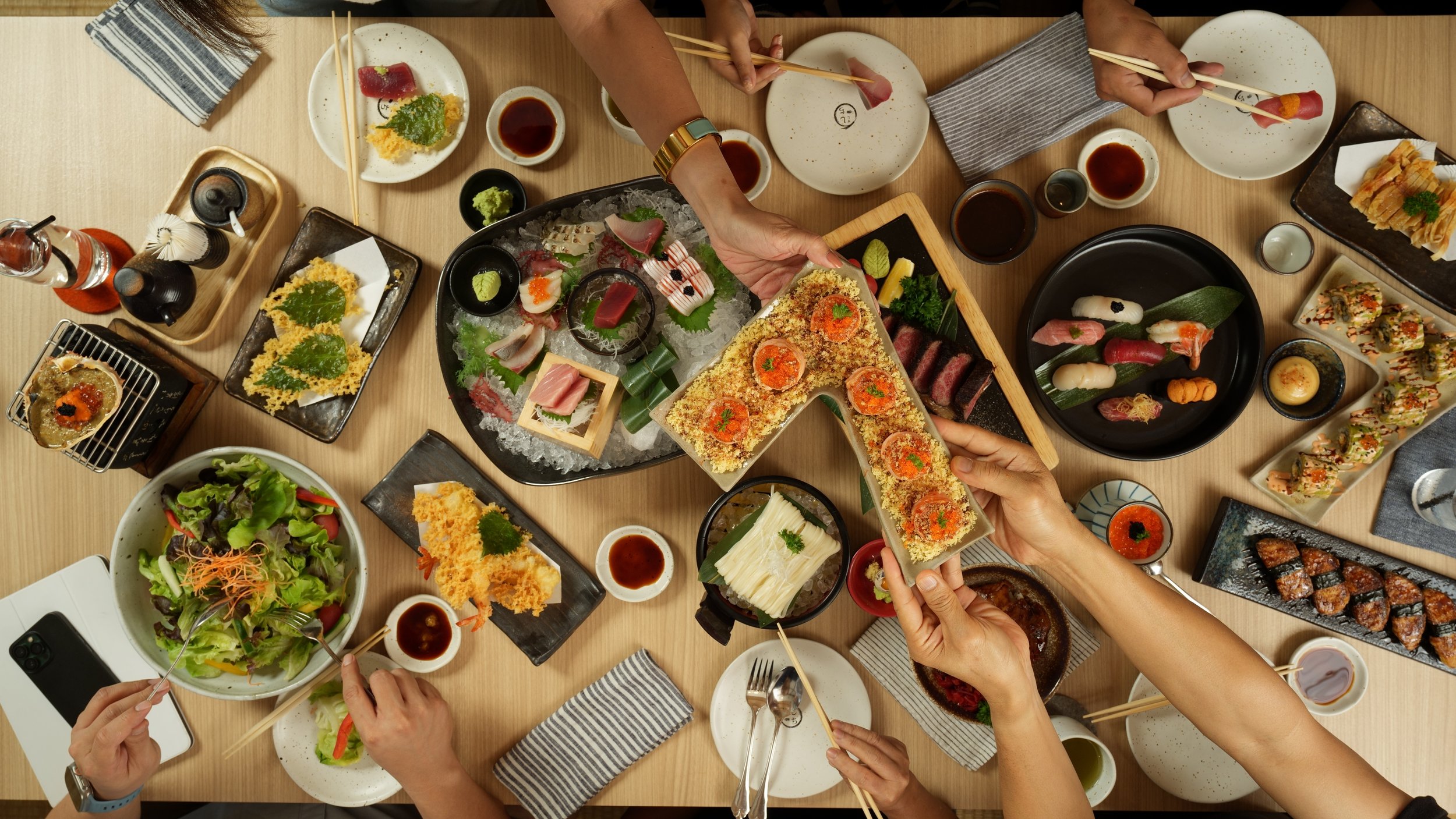
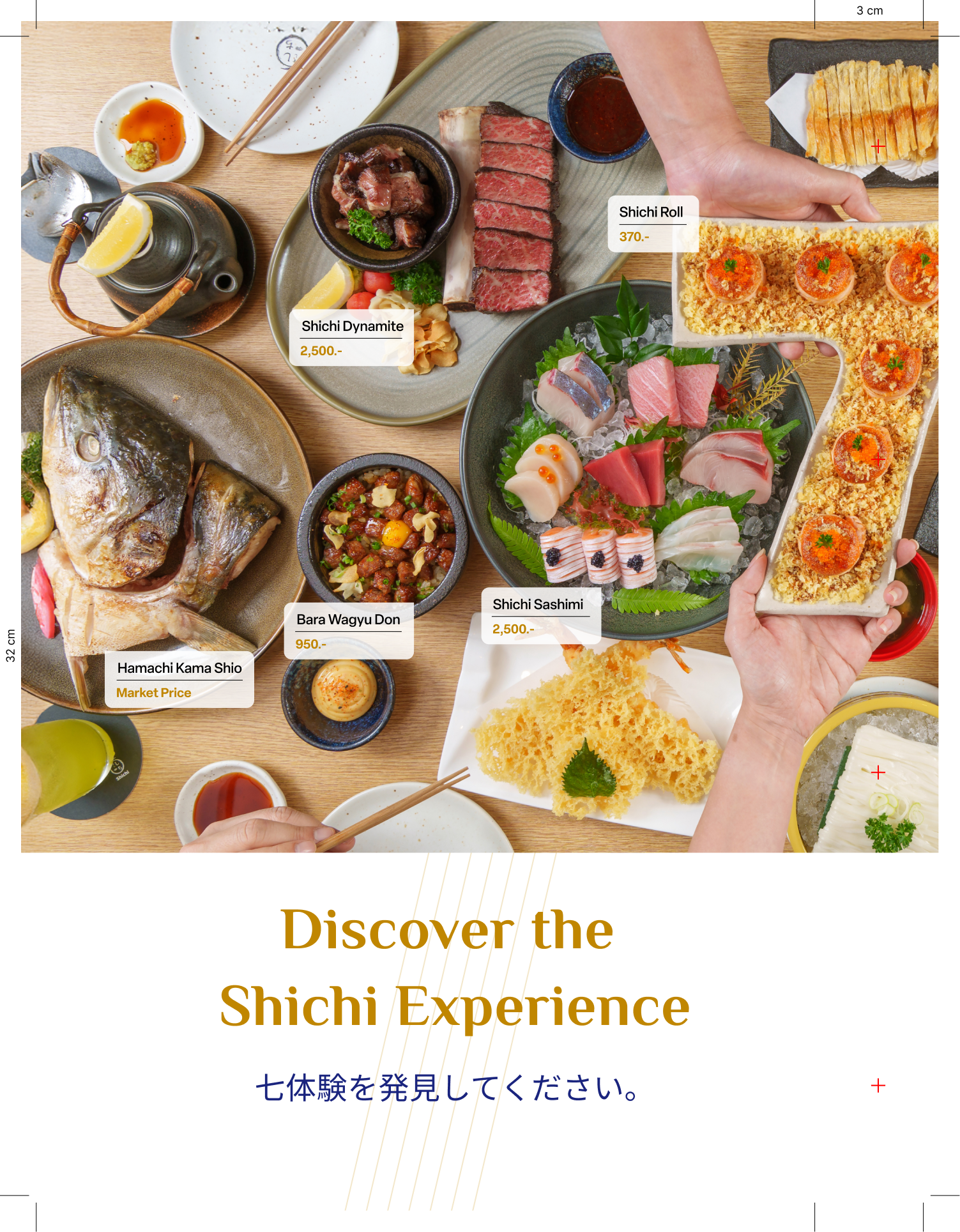
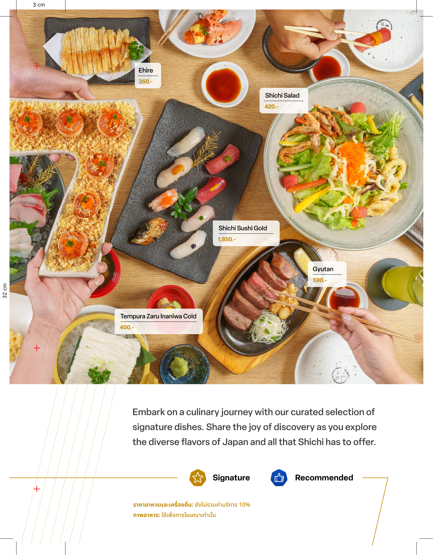
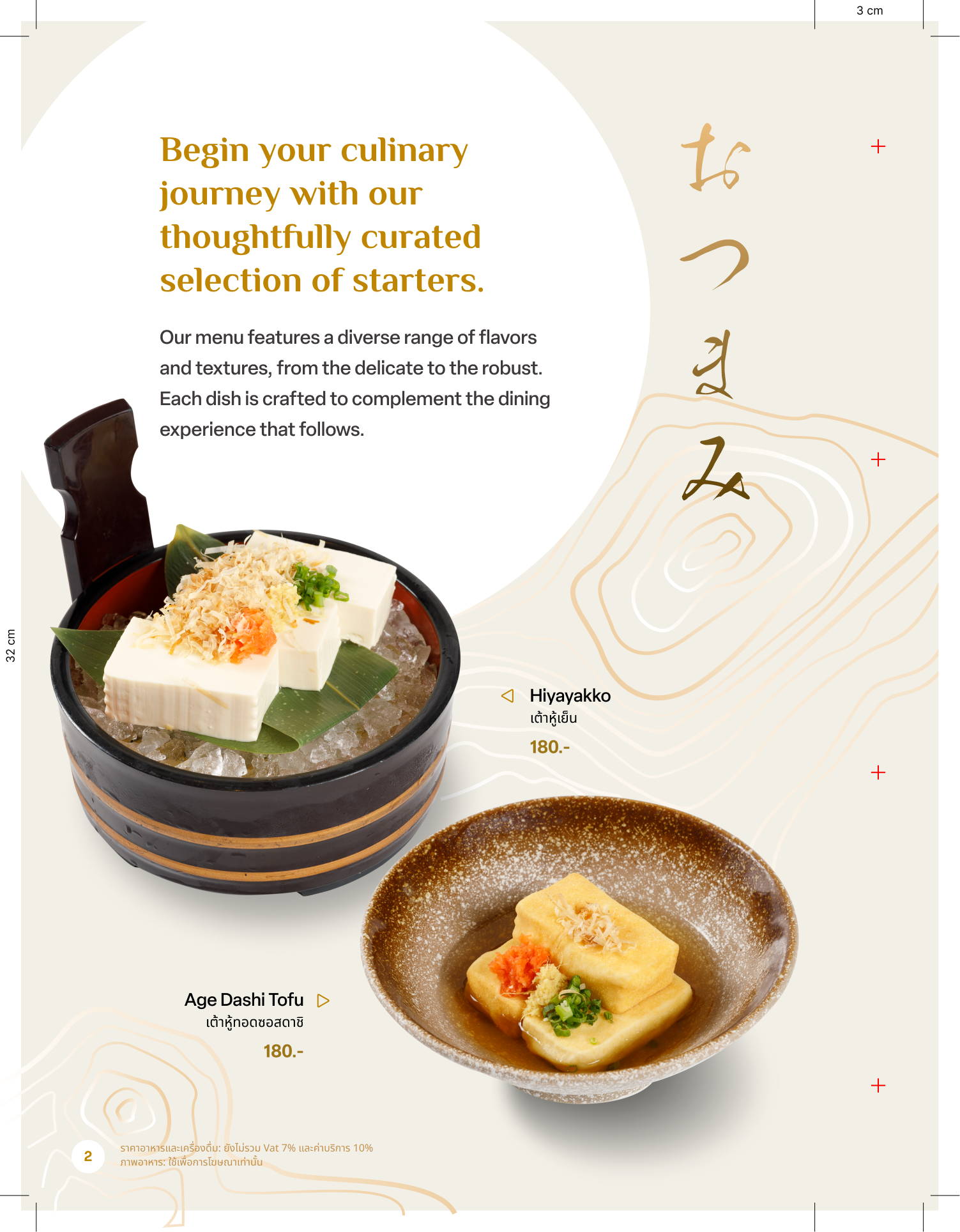
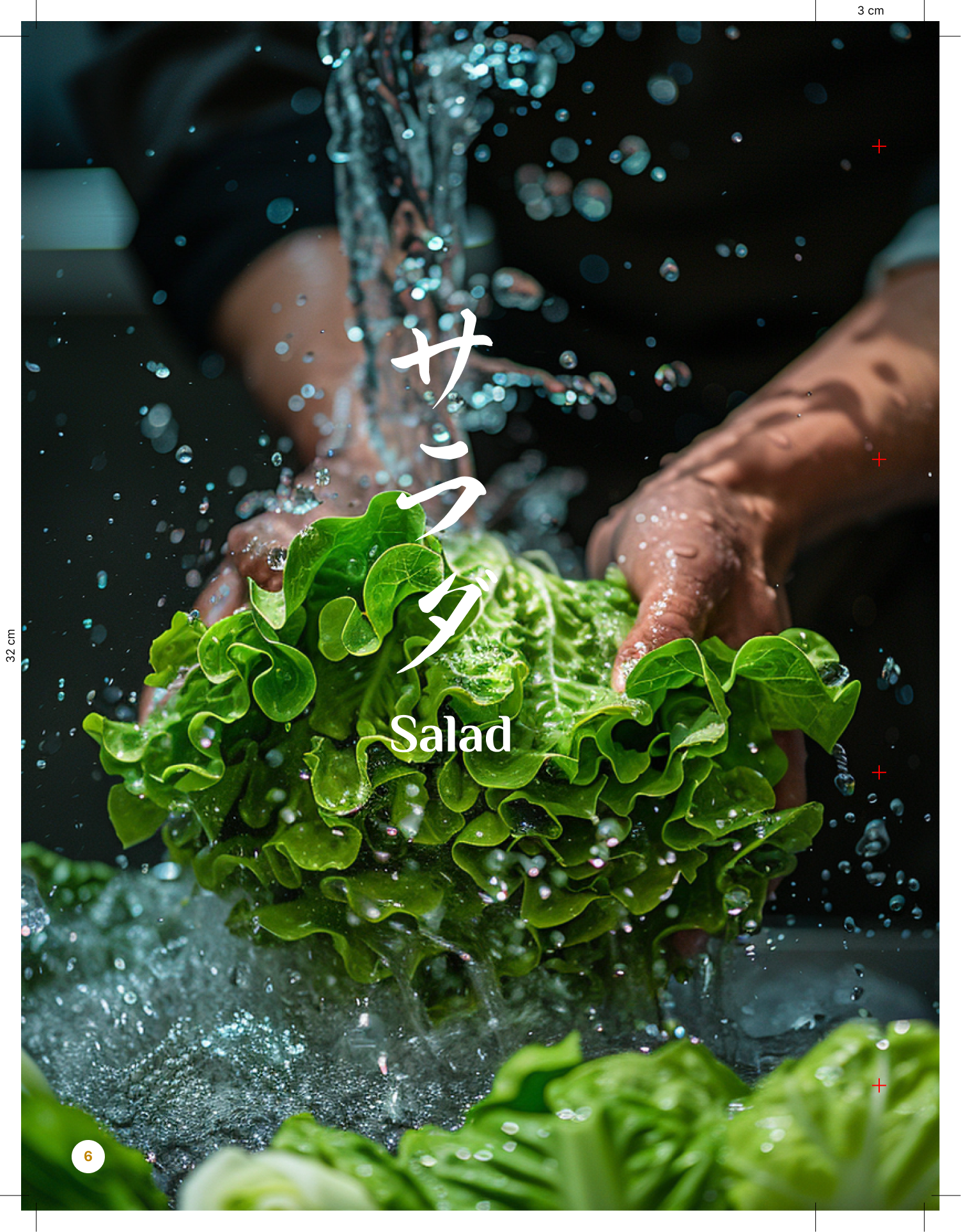
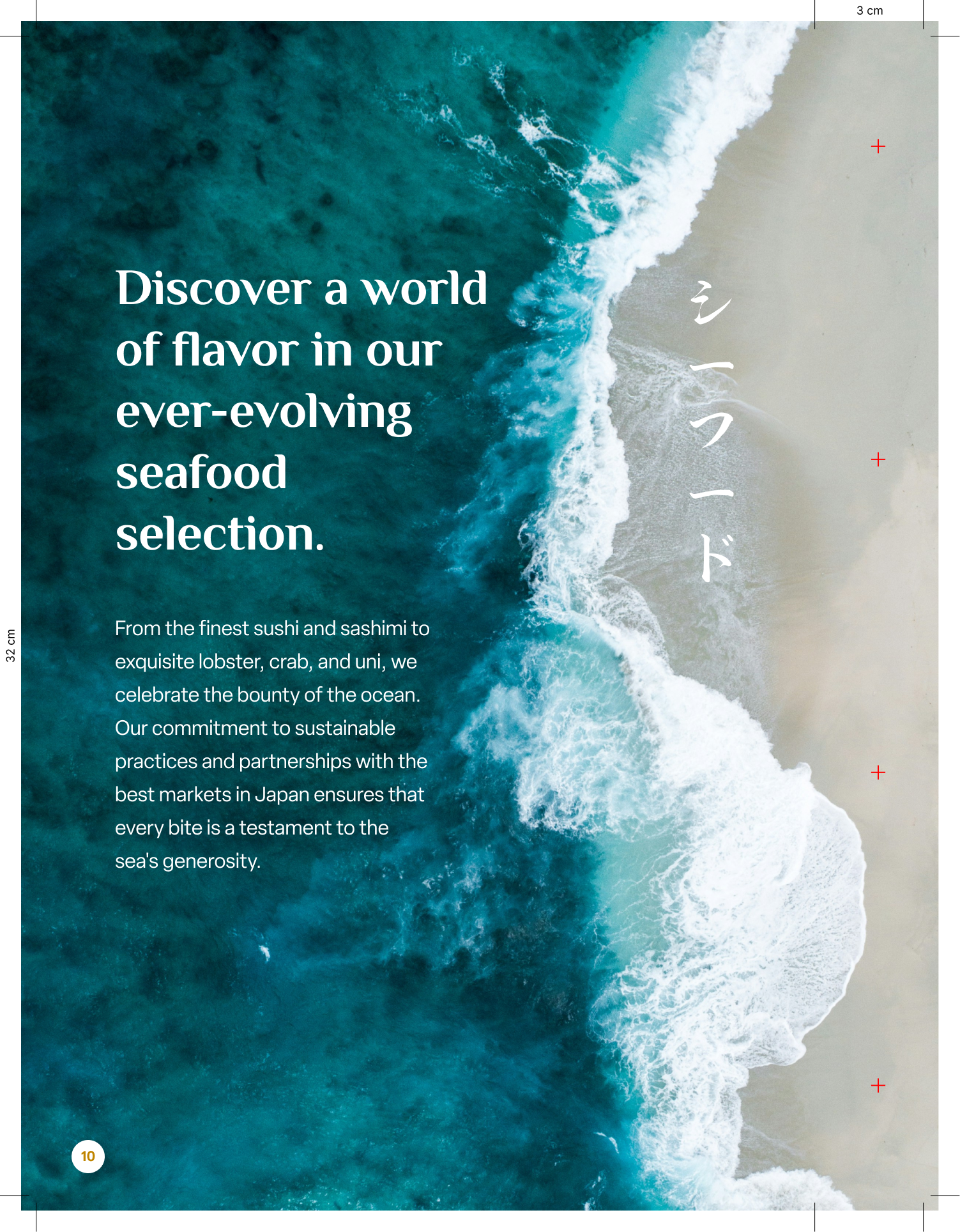
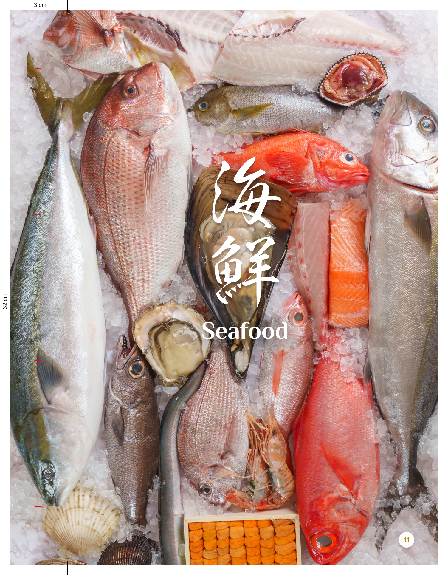
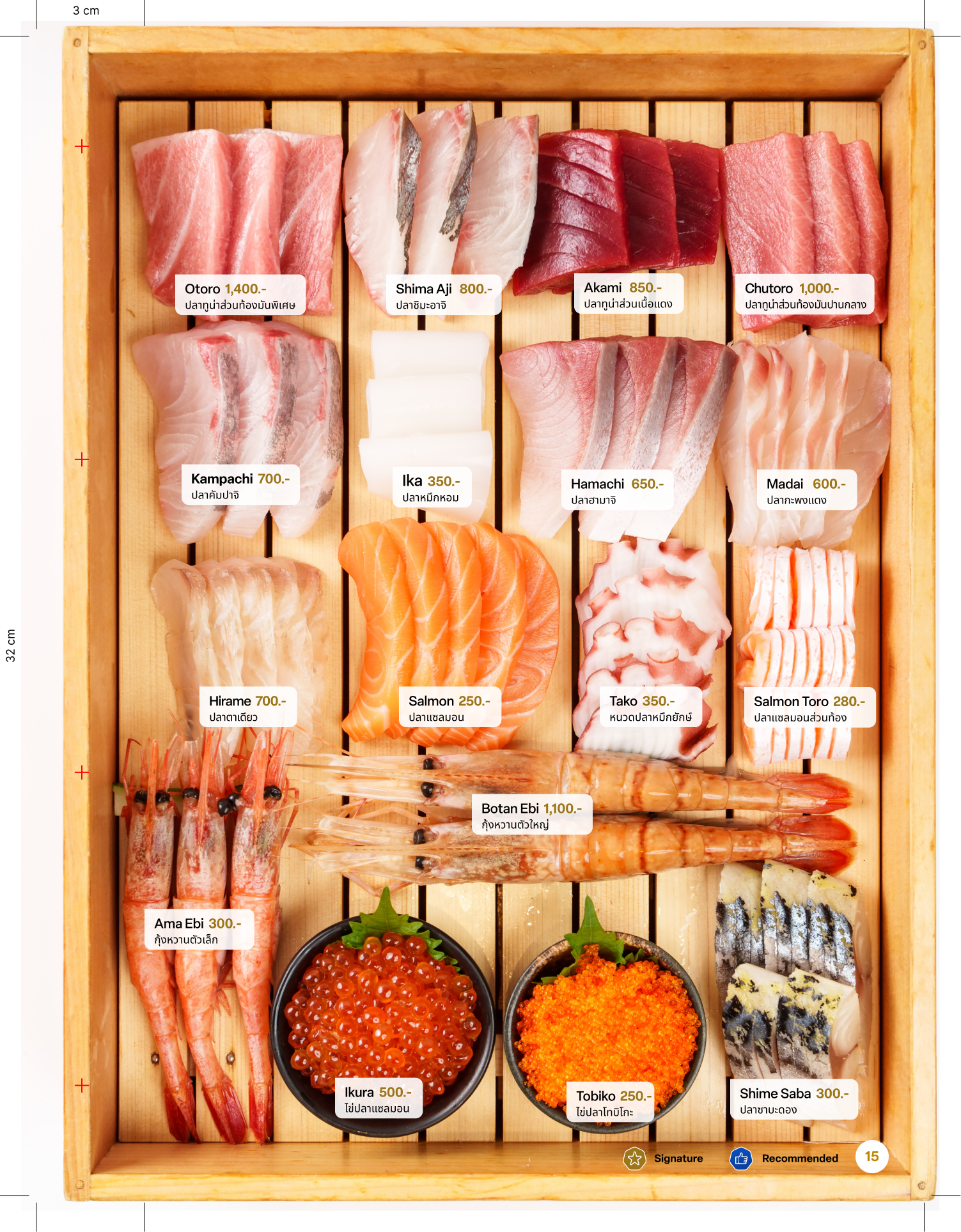
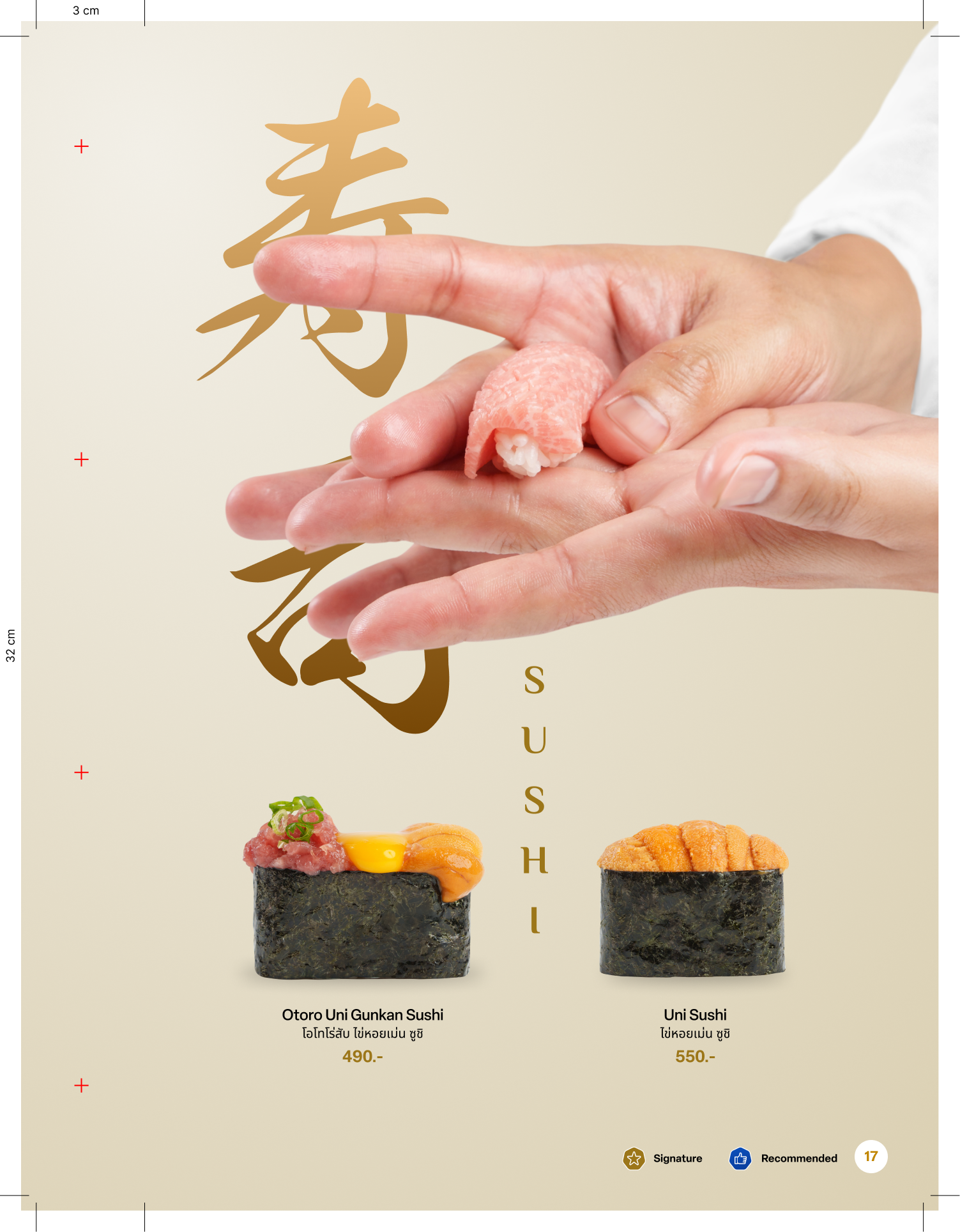
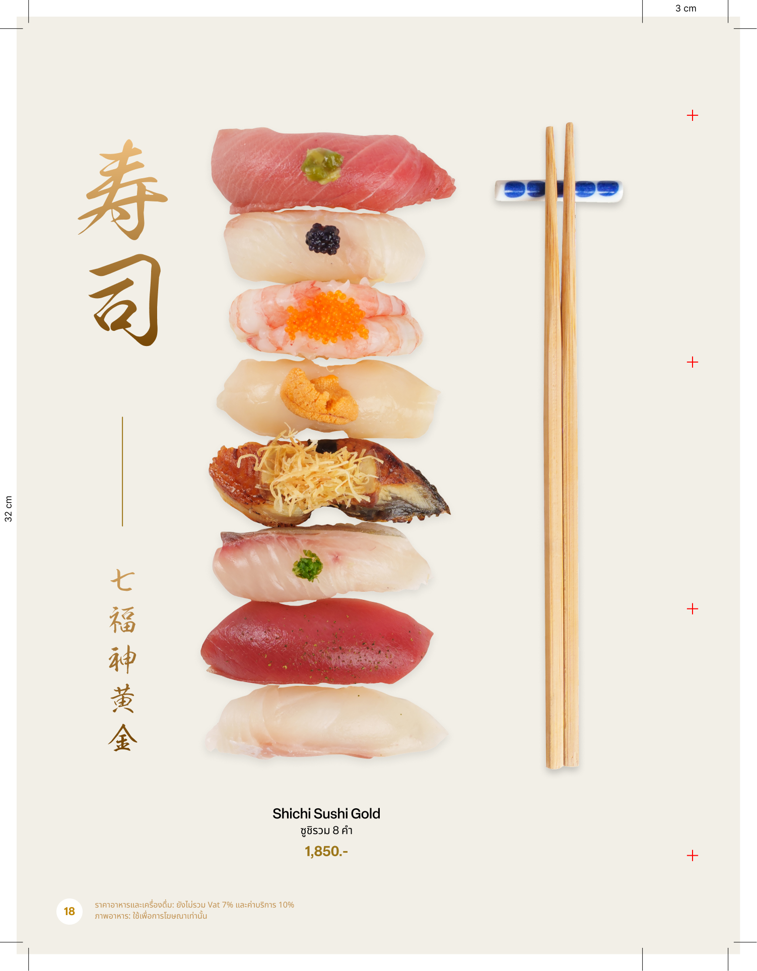
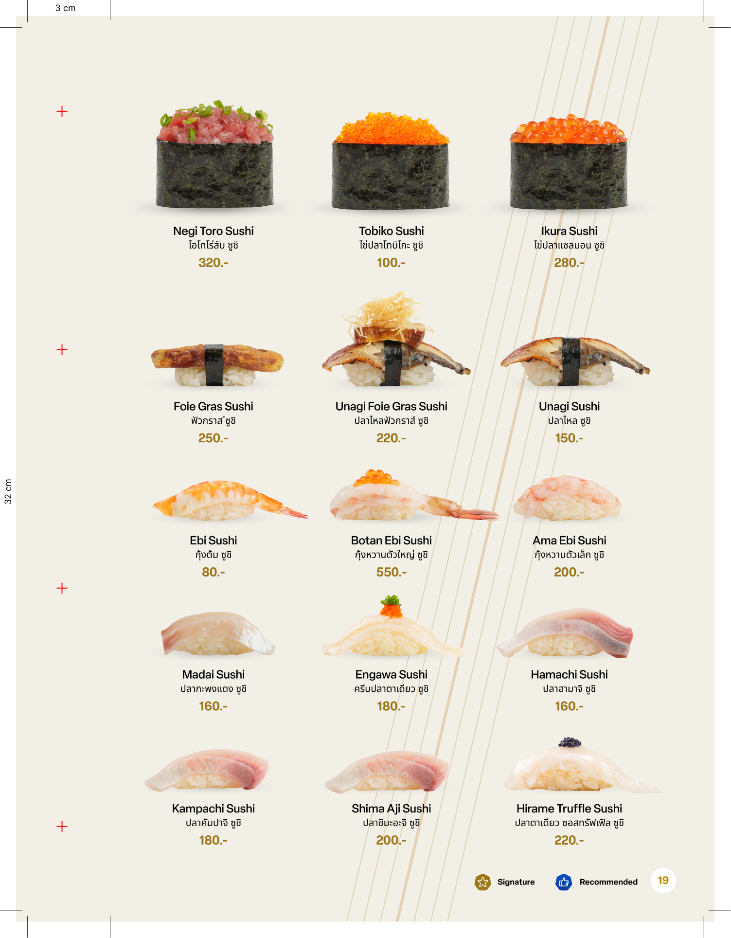
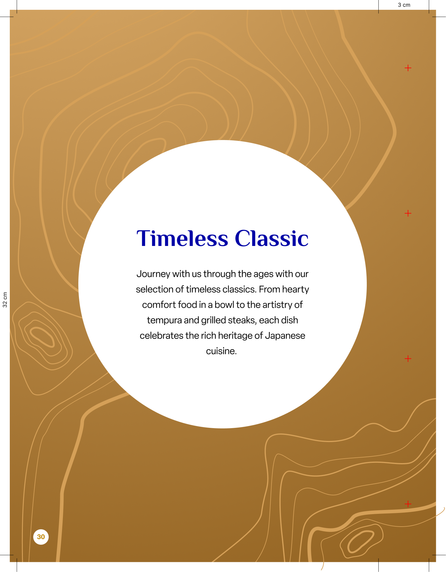
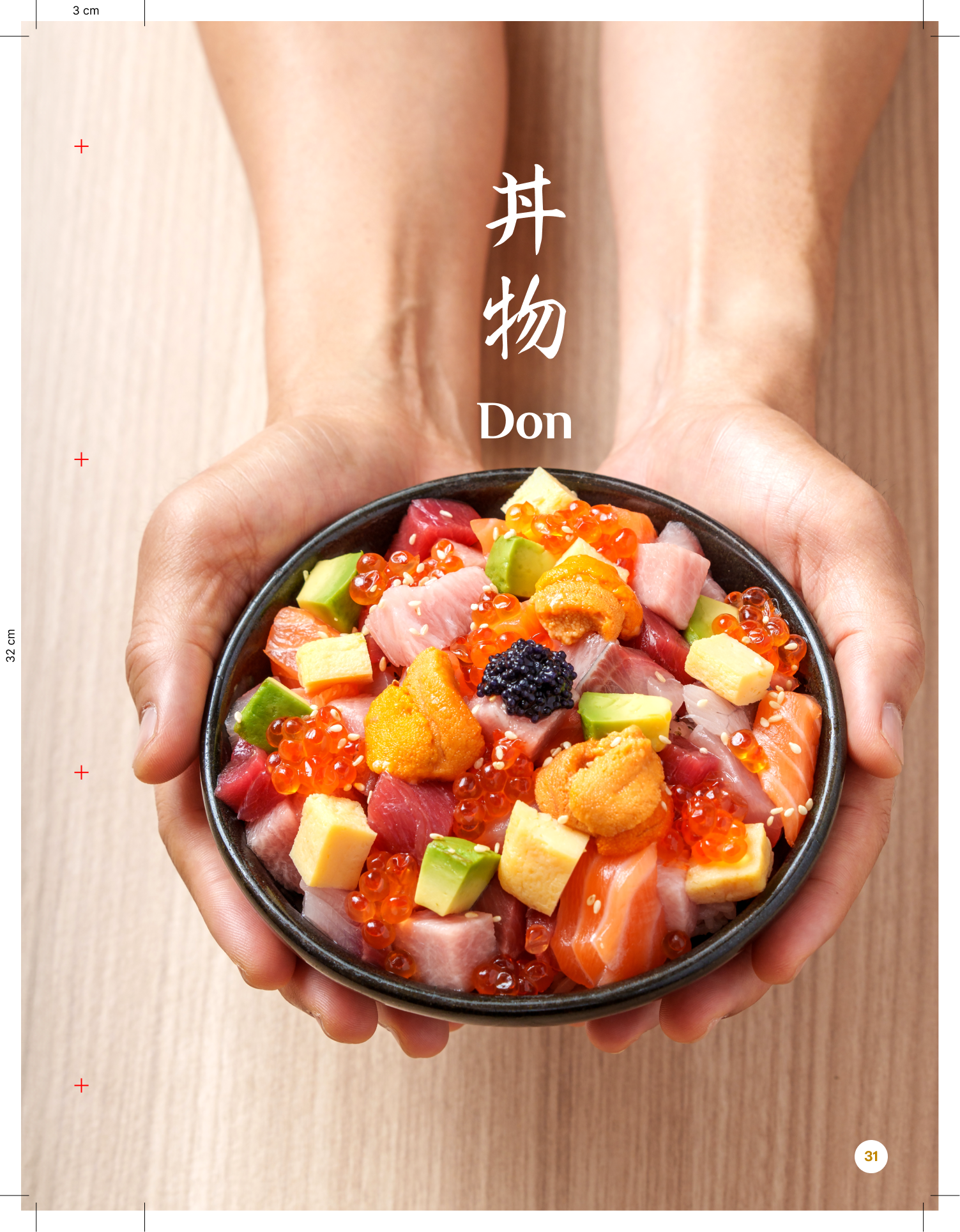
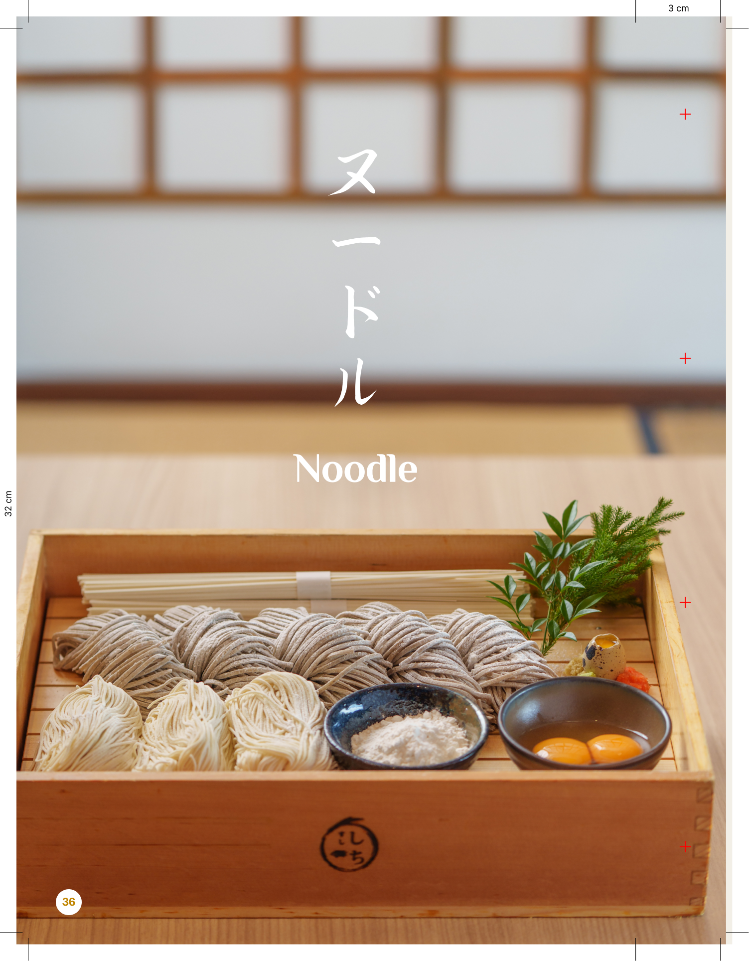
The menu is where the brand becomes tactile. We replaced traditional, cluttered layouts with a minimalist, editorial approach leaning on white space and patterns to guide the guest. By organizing the culinary journey through elements like 'Ocean' and 'Fire,' we transformed a standard menu into a curated design magazine experience.
“Whitespace was my biggest ally. In the Thai dining scene, there's a tendency to fill every inch of the page. By pushing back and giving the imagery room to breathe, we immediately signaled to the guest that Shichi is a premium, modern destination.”
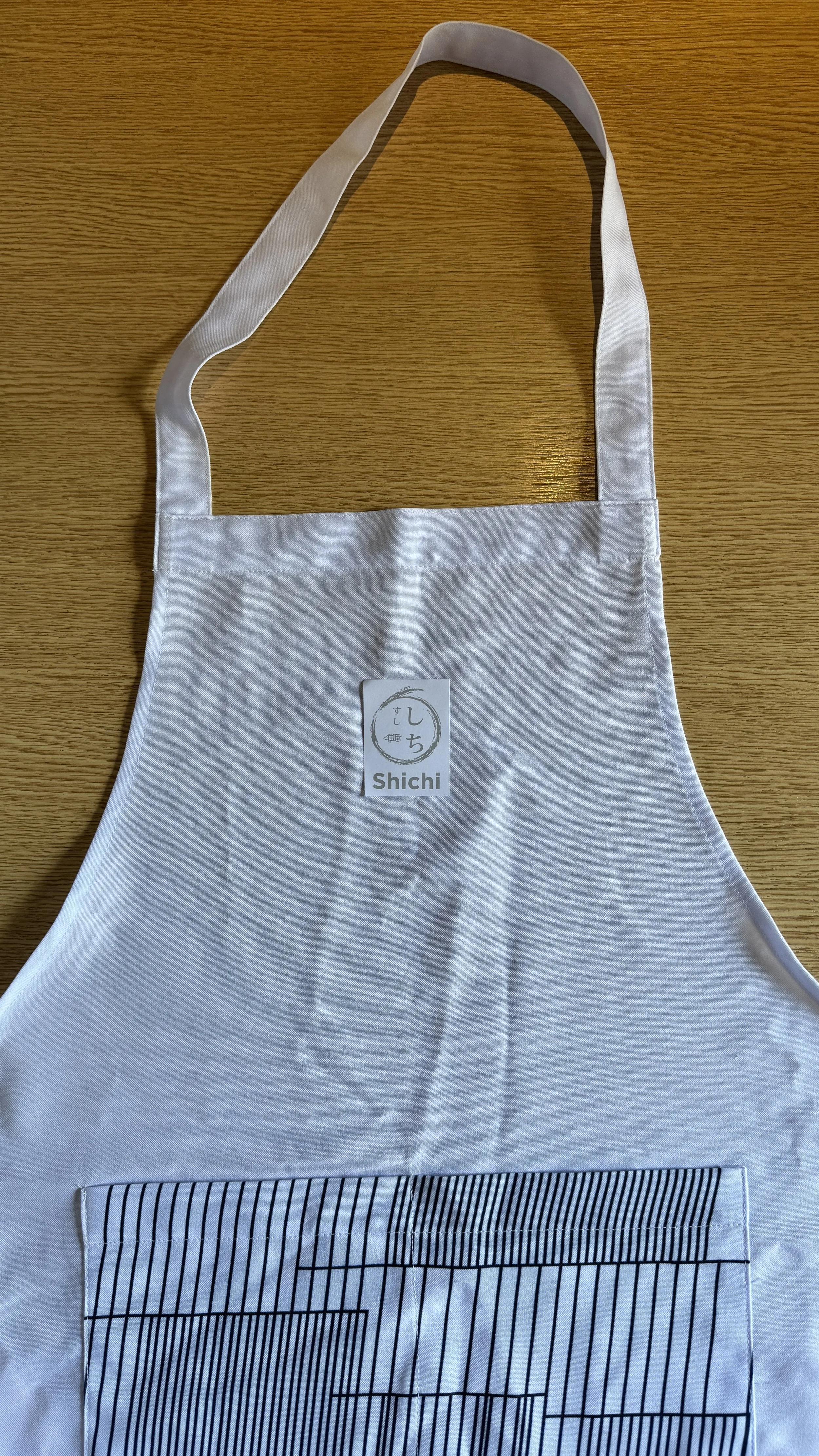
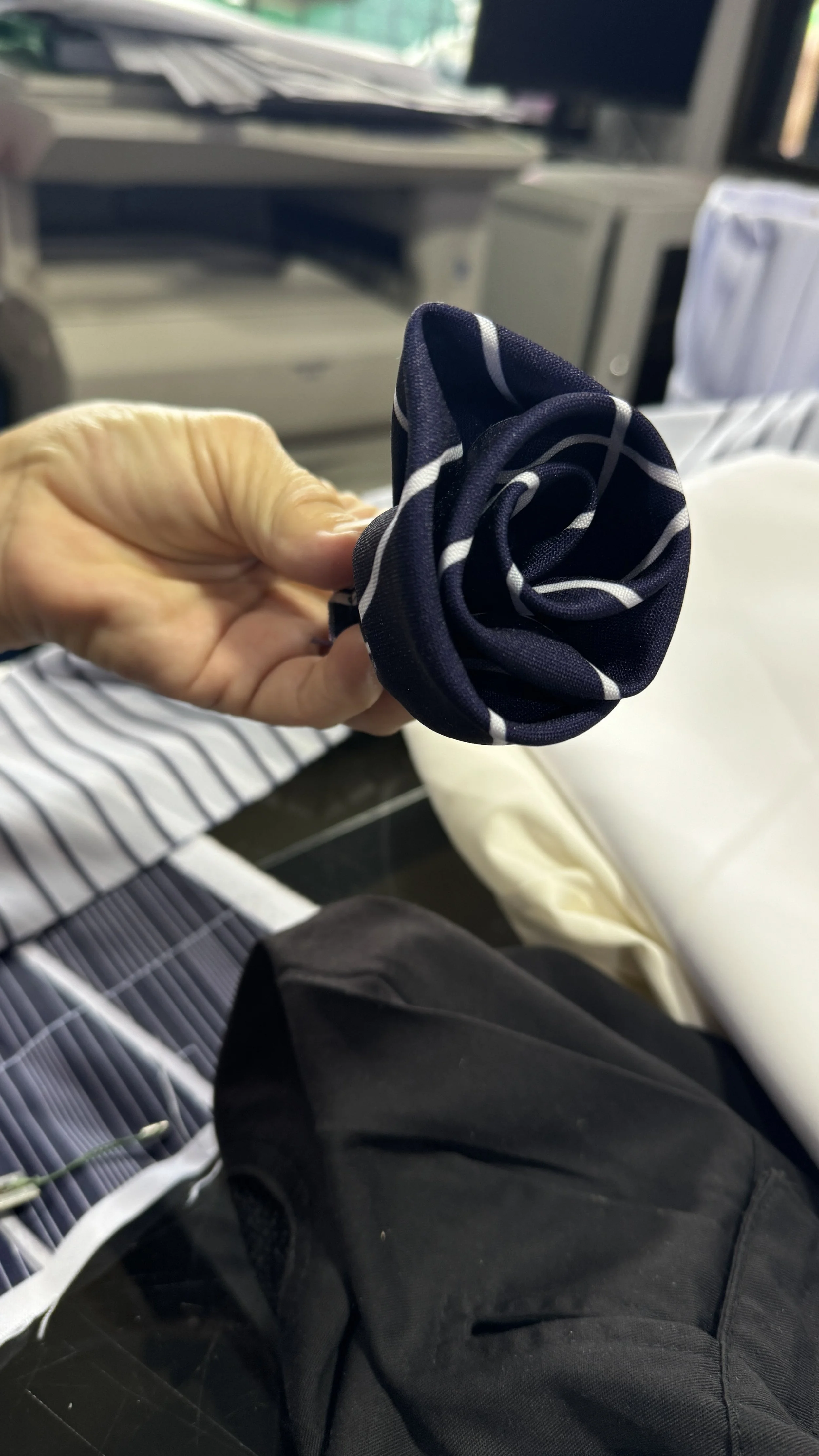
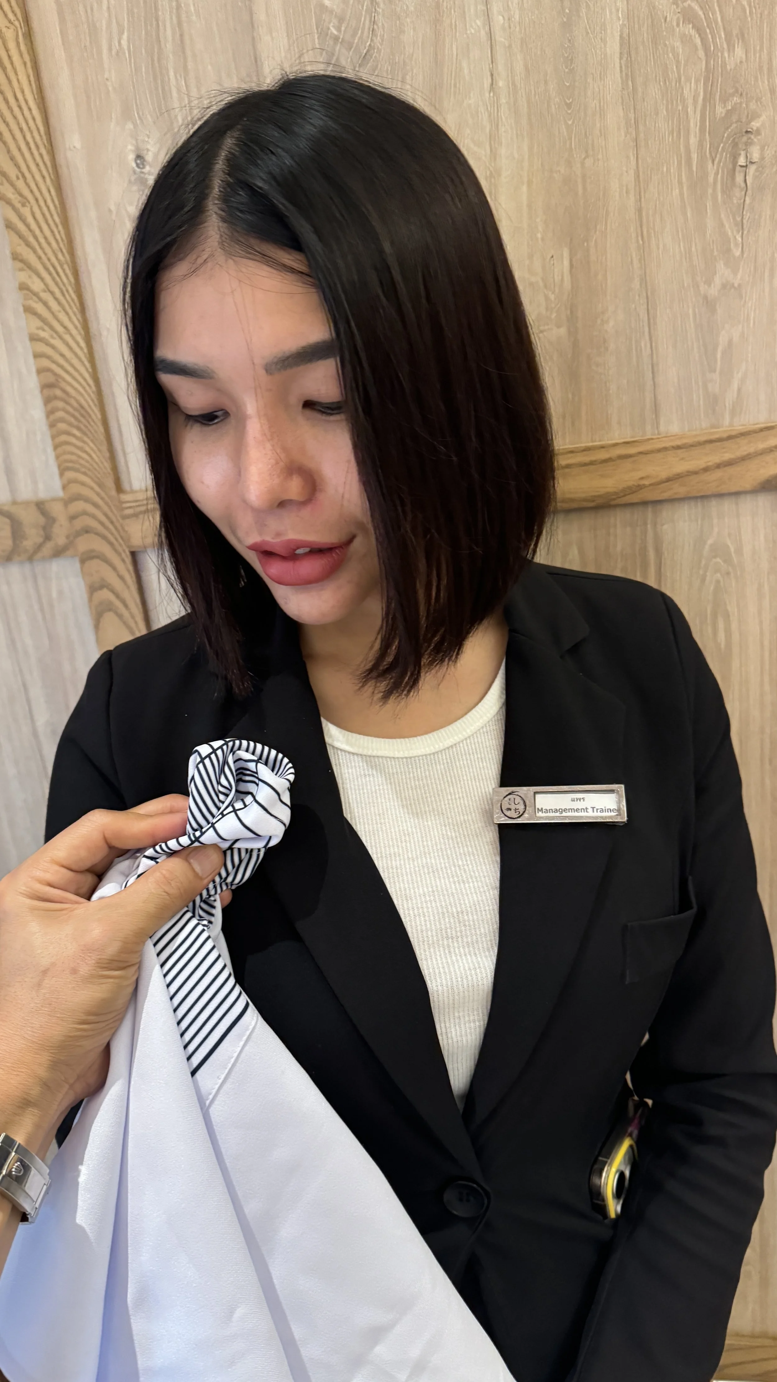
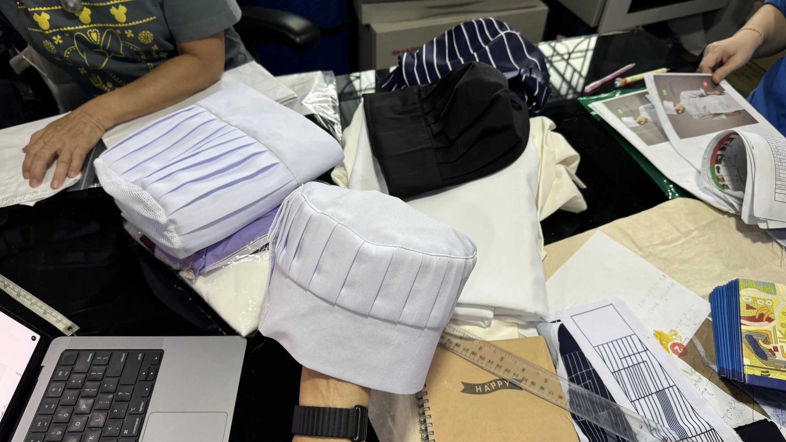
Tangible Objects
The "Hands-On" Craft
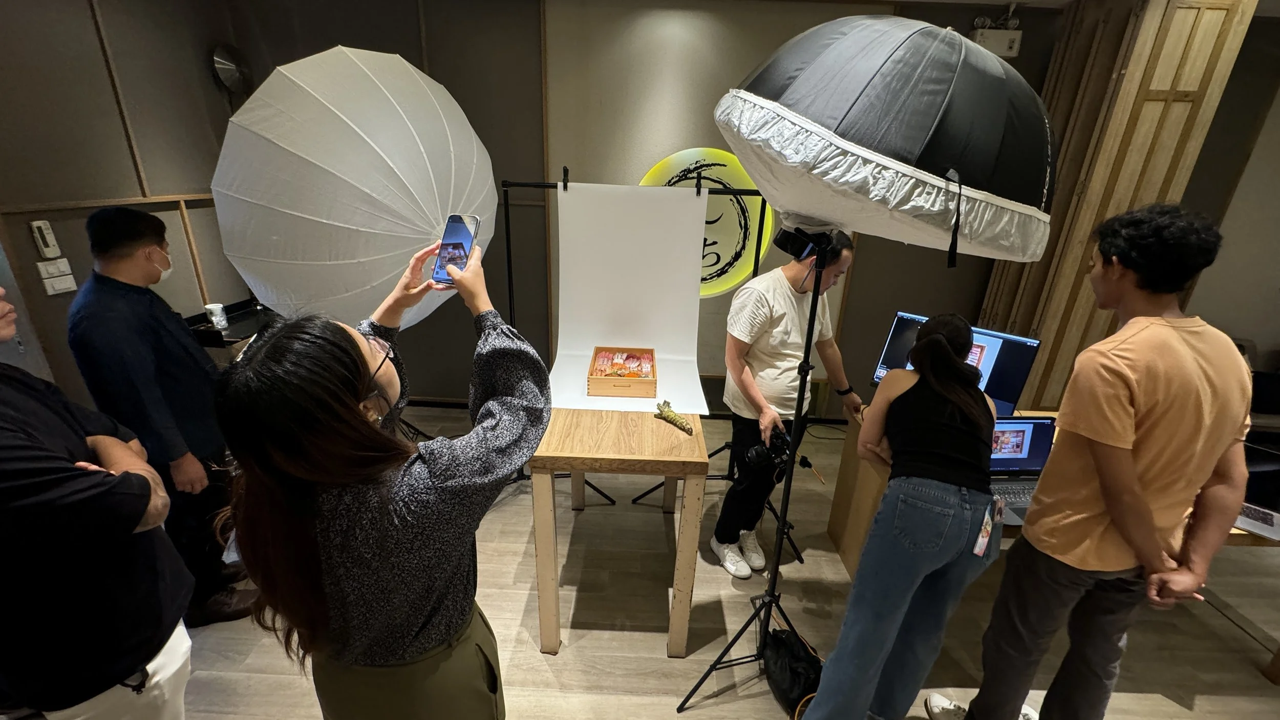
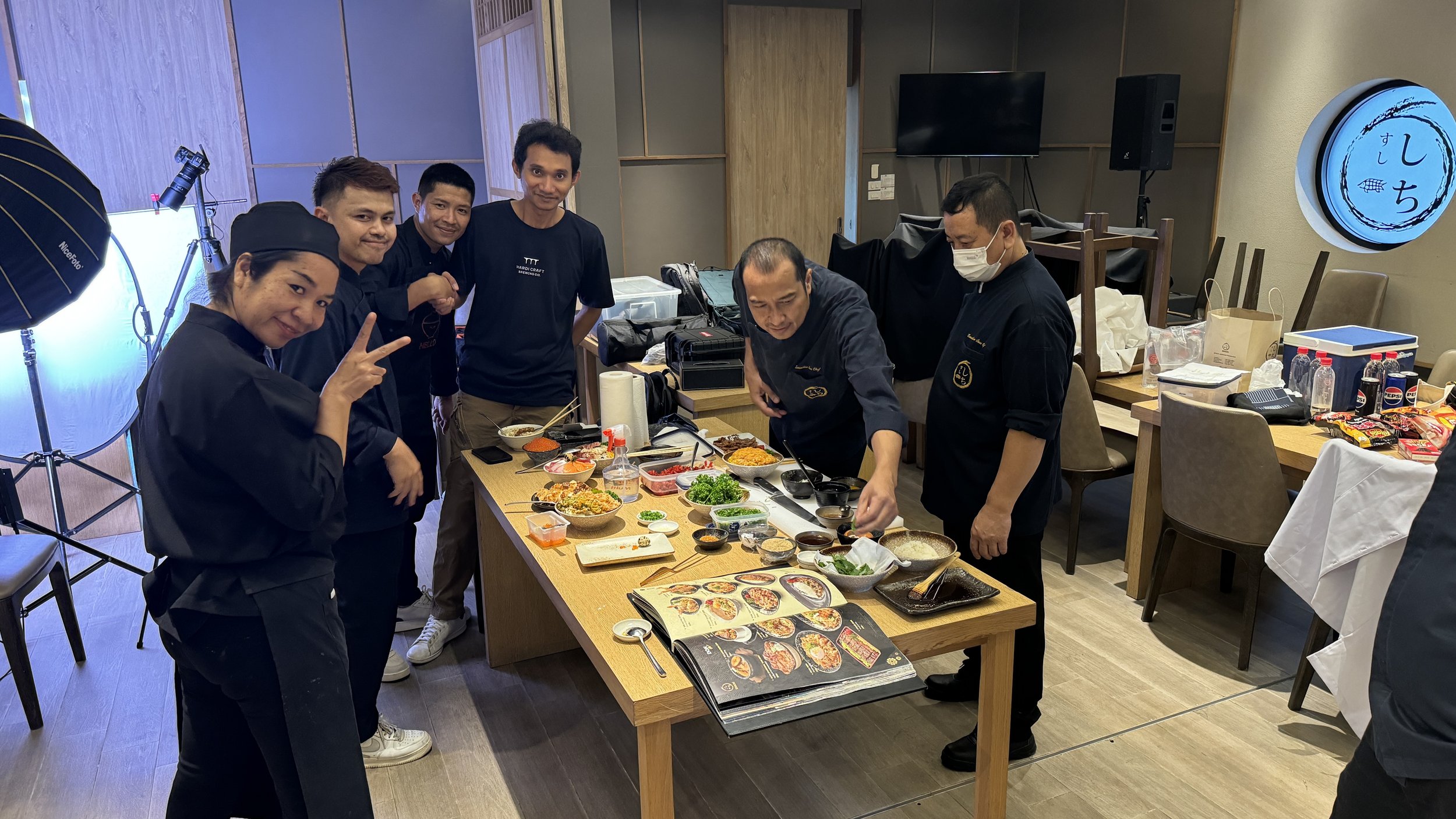
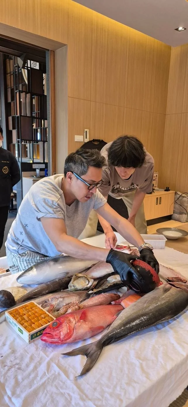
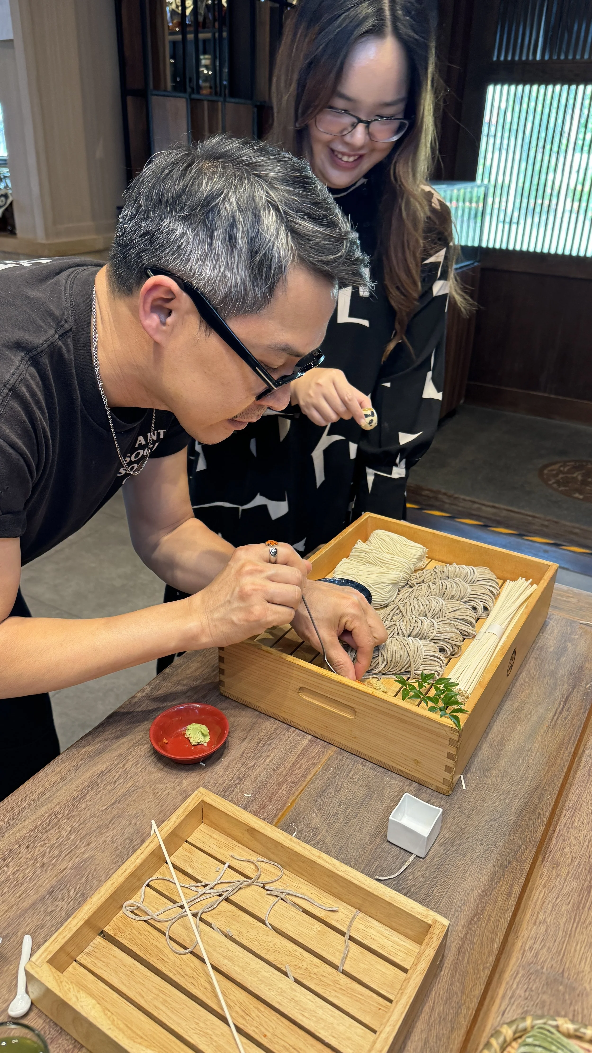
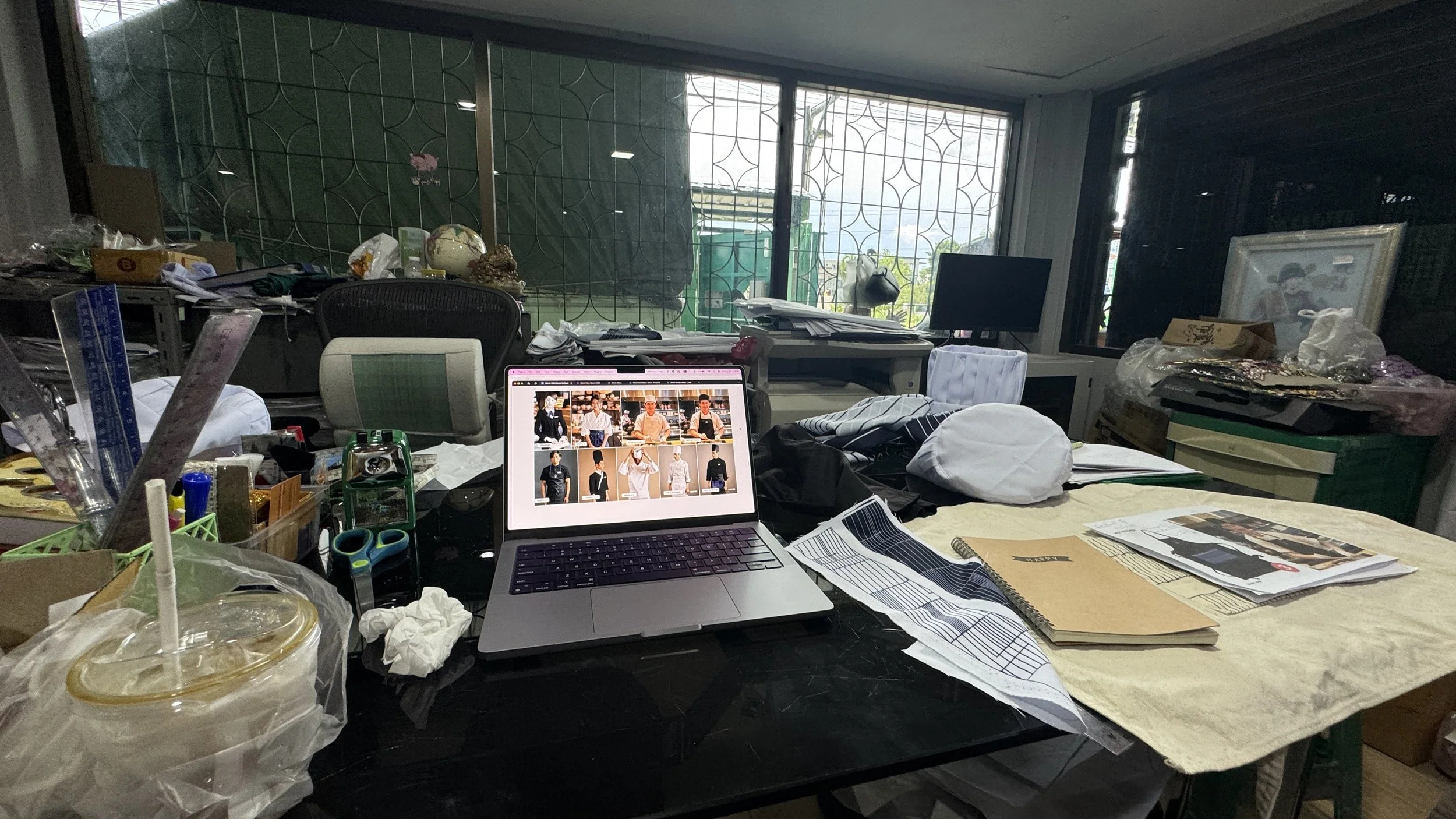
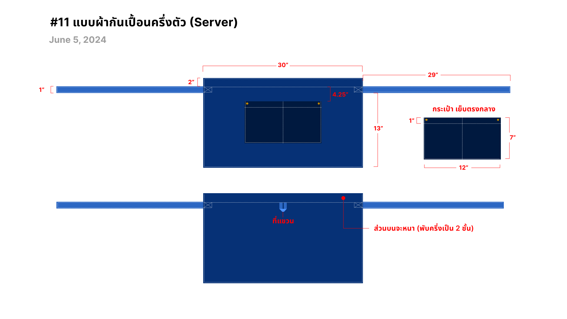
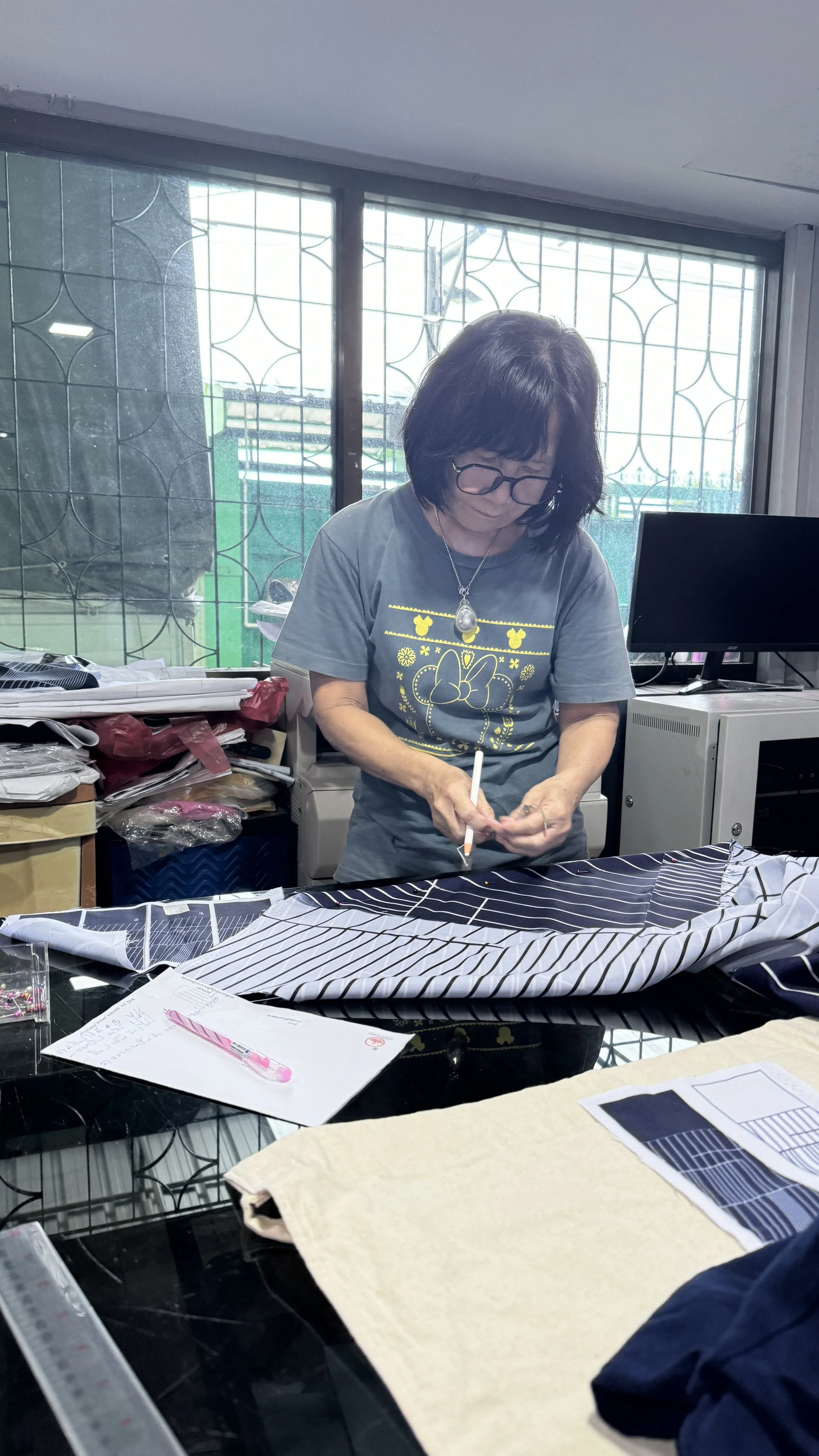
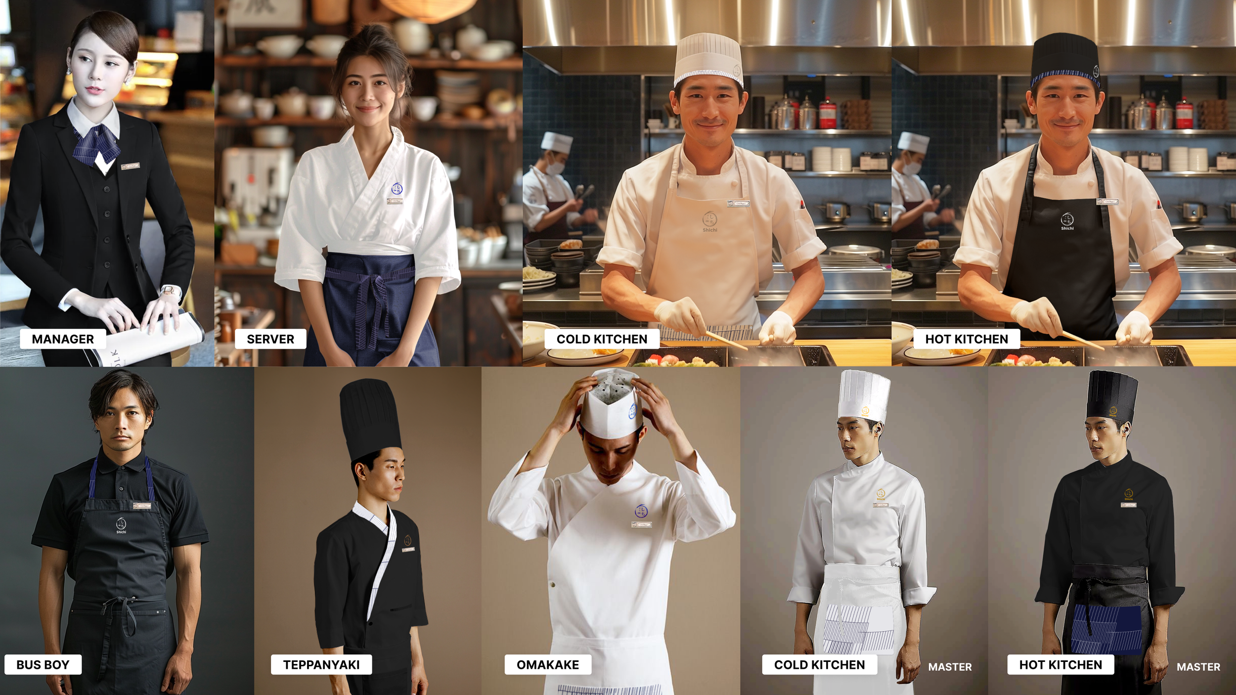
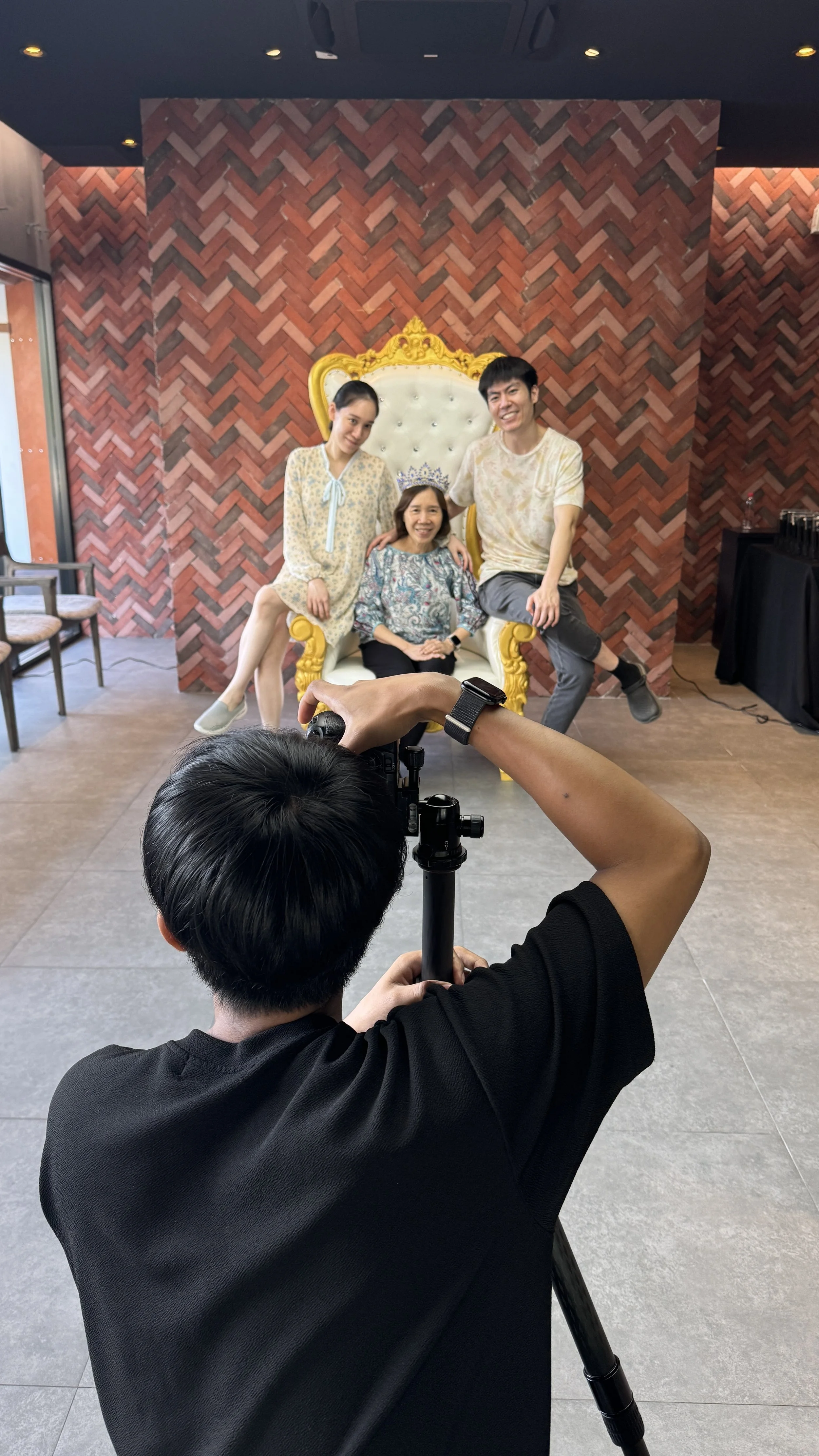
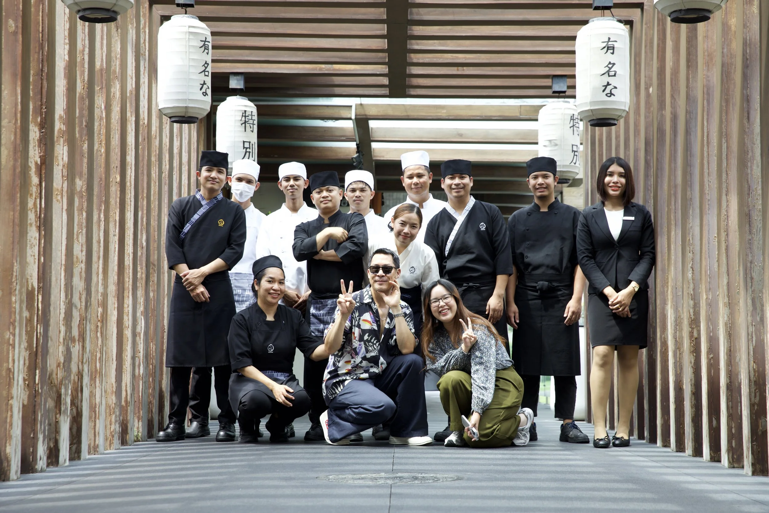
After months of remote collaboration with the Thai-based design and marketing teams, I knew the final details required a physical presence. I moved on-site to oversee the tactile execution directing the culinary photoshoot, uniform fabrication, and print production. This hands-on approach ensured that every texture and image aligned perfectly with the brand’s new modern identity.
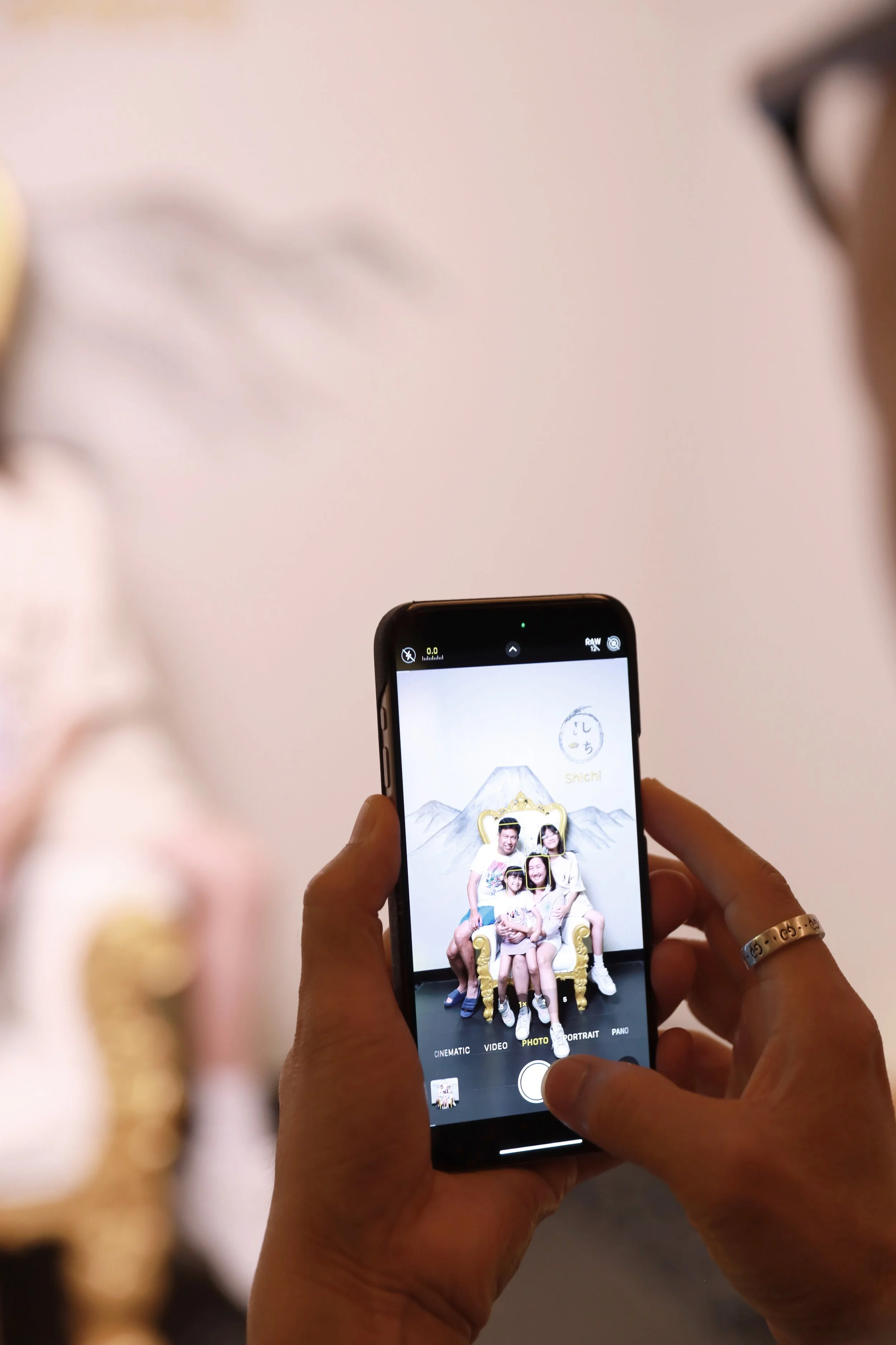
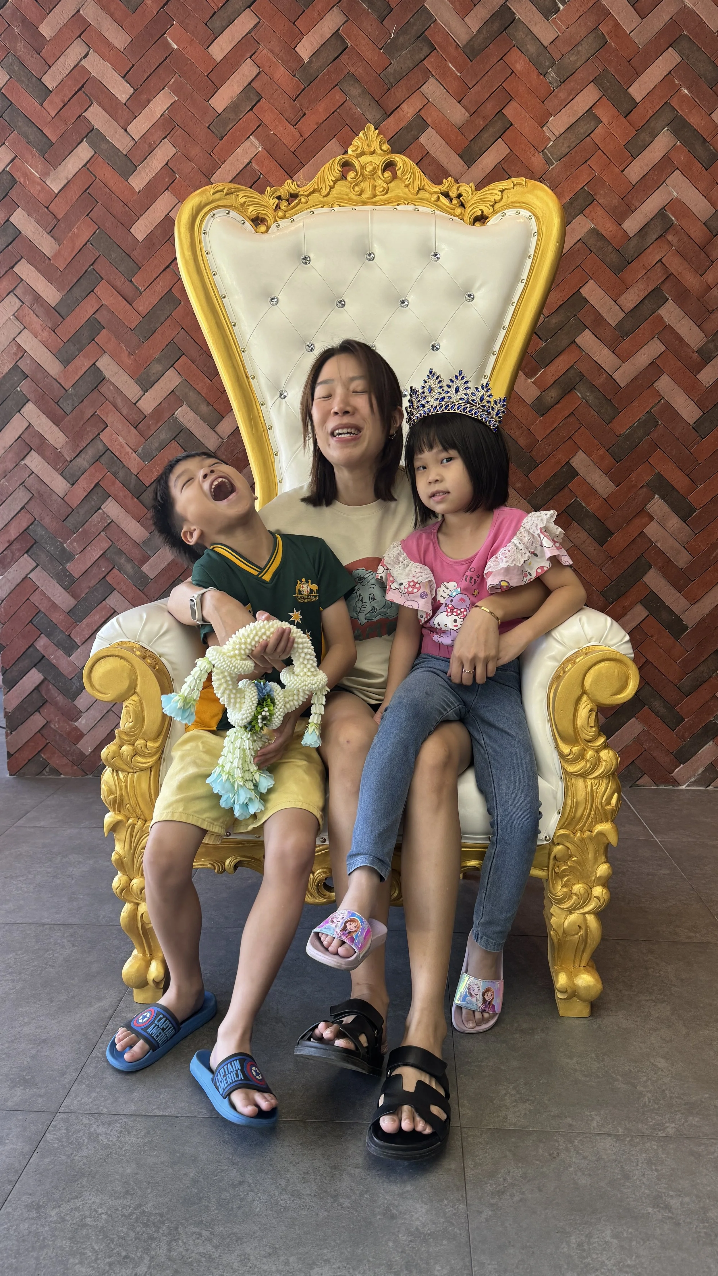
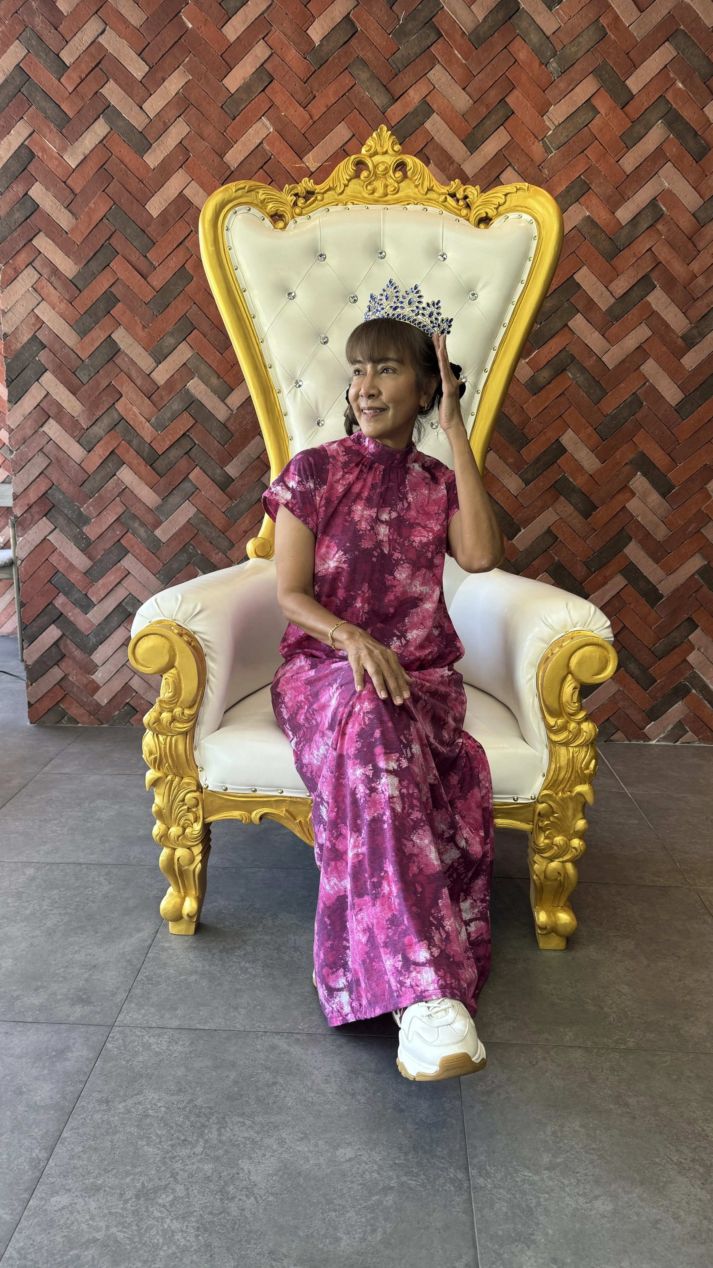
The Outcome — Queen for a Day
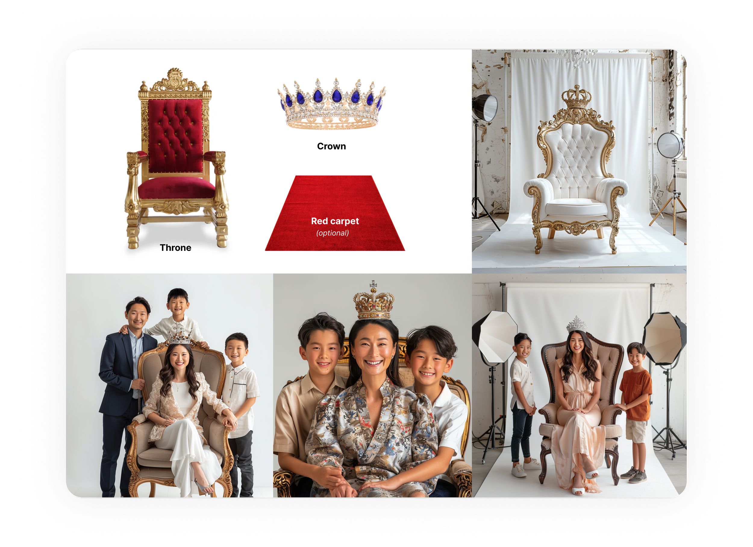
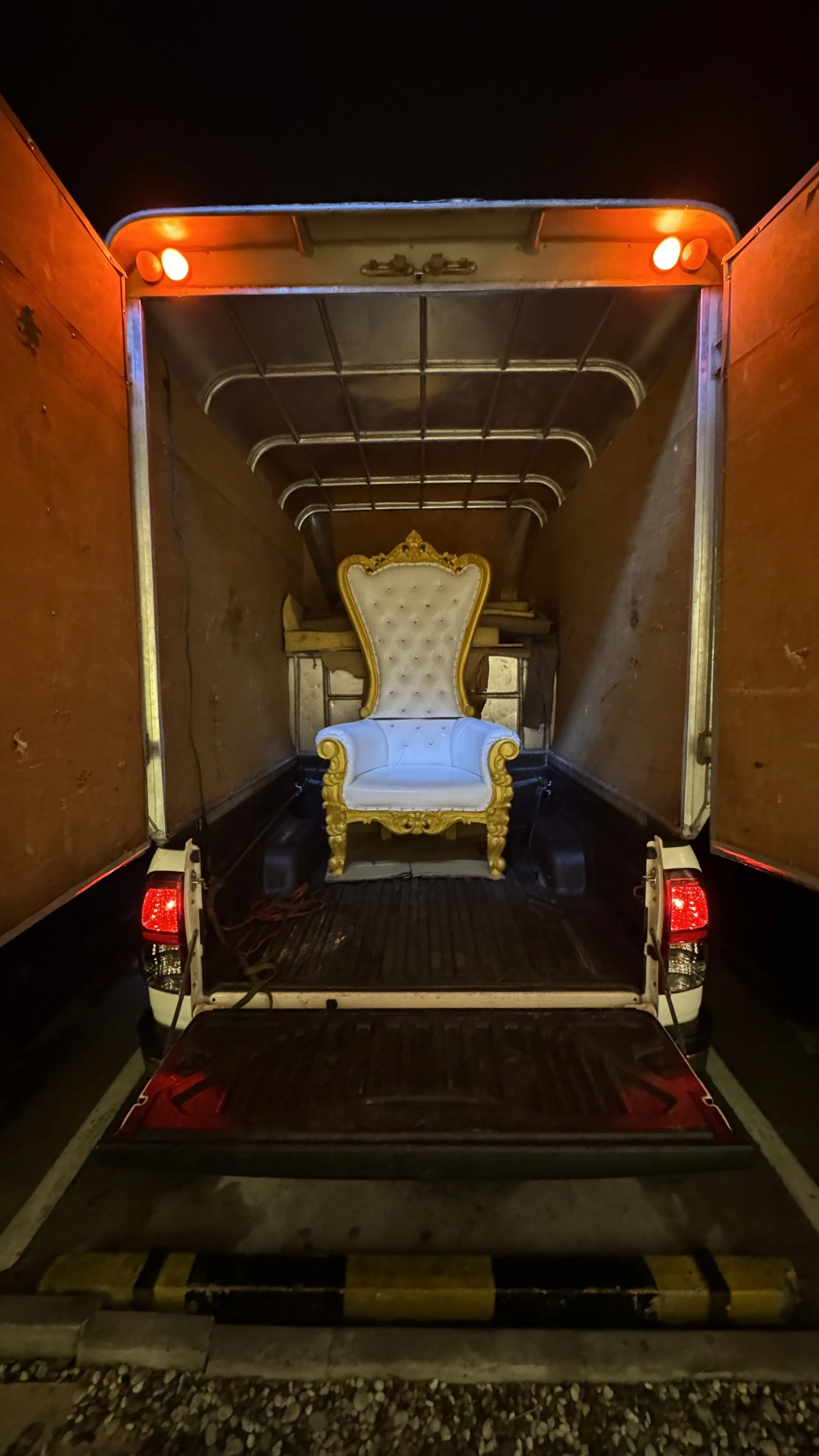
The rebrand launch coincided with Mother’s Day, providing a perfect stage to demonstrate the strategy in action. To show the marketing team the potential of the new brand voice, I pitched turning a simple photo giveaway into a curated "Queen for a Day" event. By leaning into the cultural reverence for the Thai monarchy, we sourced a throne and tiaras to transform every mother into royalty. The result was a high-energy "Kizuna" moment that bridged the gap between management, staff, and guests, proving that a unified story can turn a routine meal into a community milestone.
The marketing team just wanted to hand out framed photos. I knew we could do better. Hunting down a throne and tiaras turned a static photo-op into a performance. Seeing the staff clowning around with the guests was the moment the Kizuna philosophy finally felt real it was about becoming one family, if only for an afternoon.
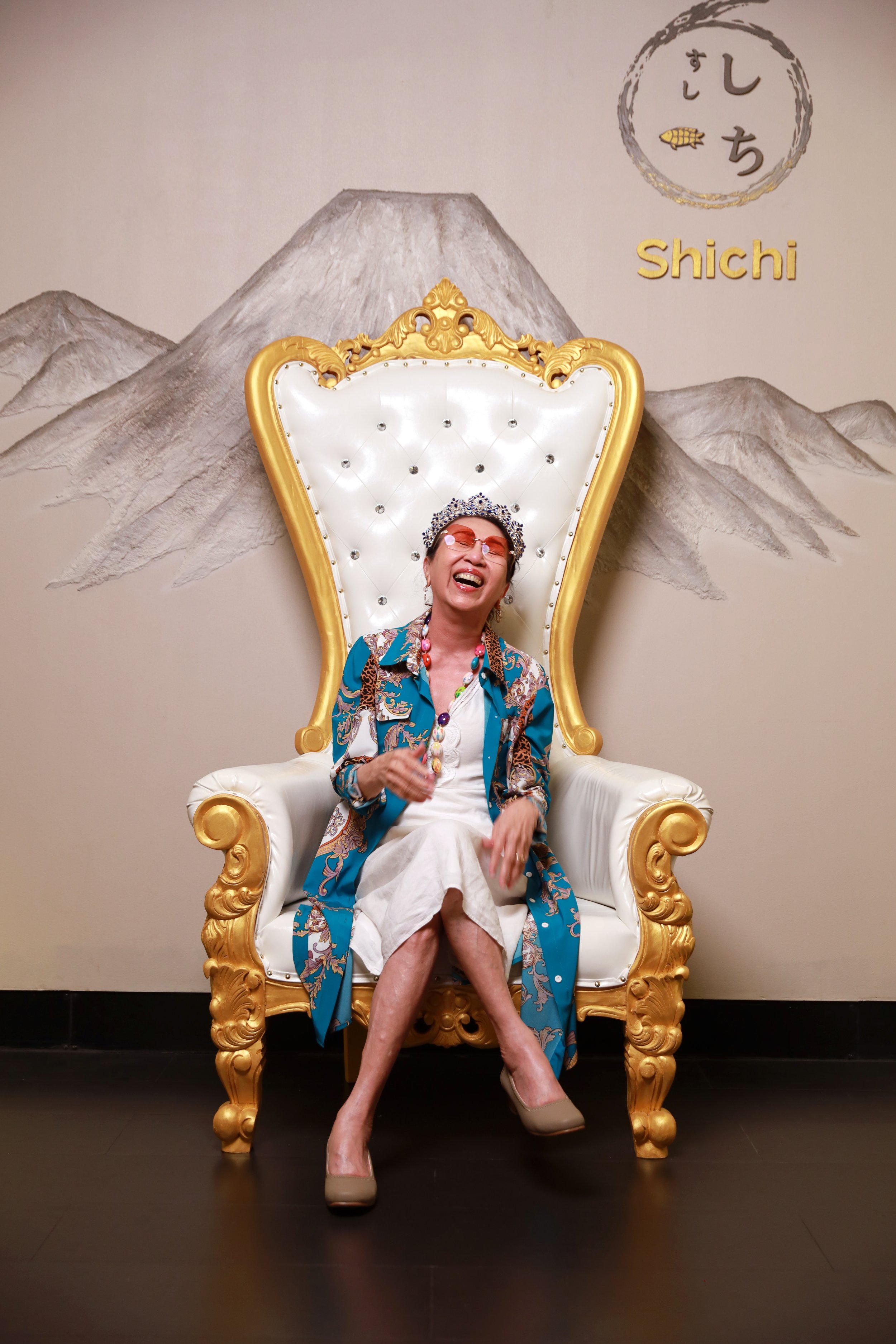
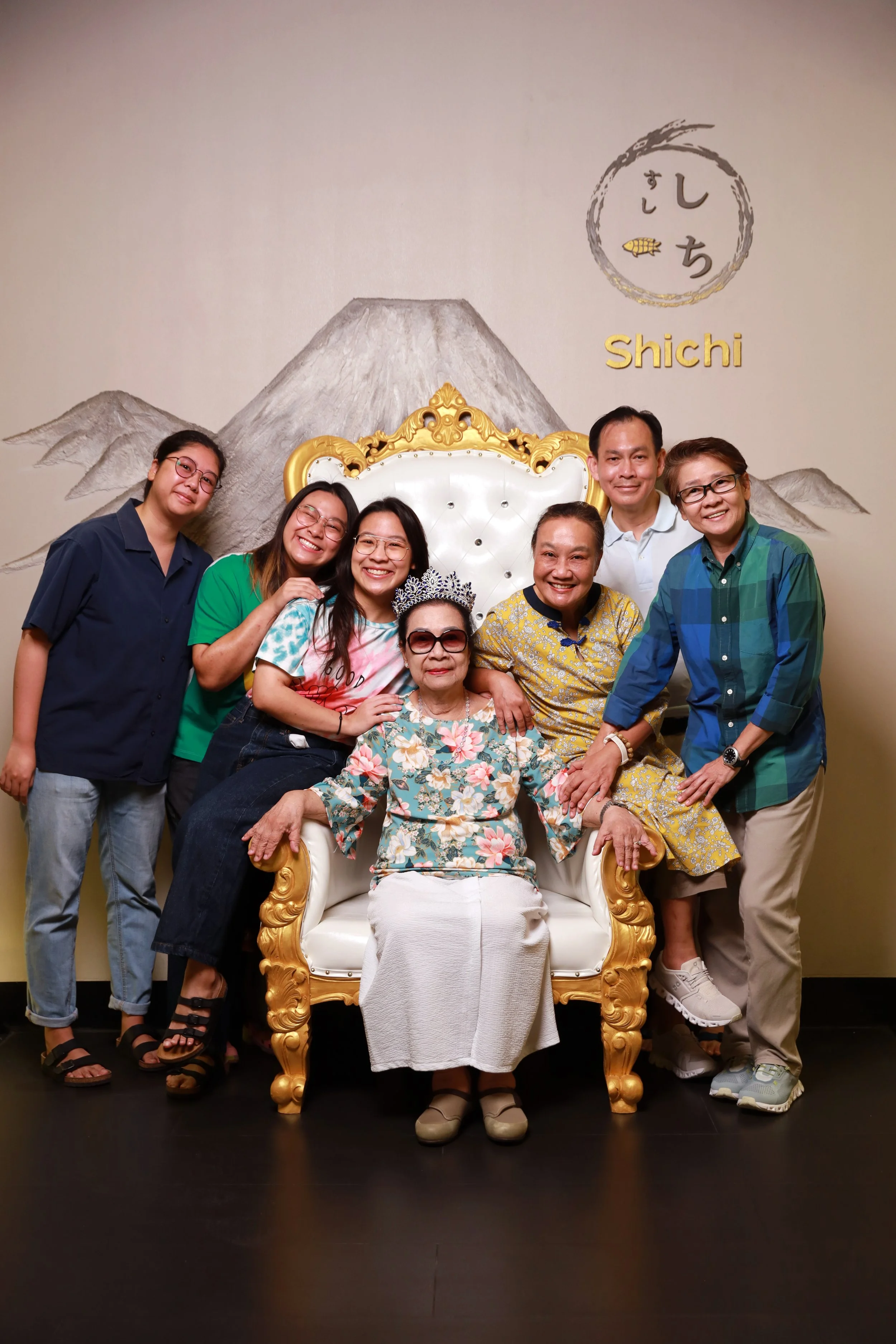
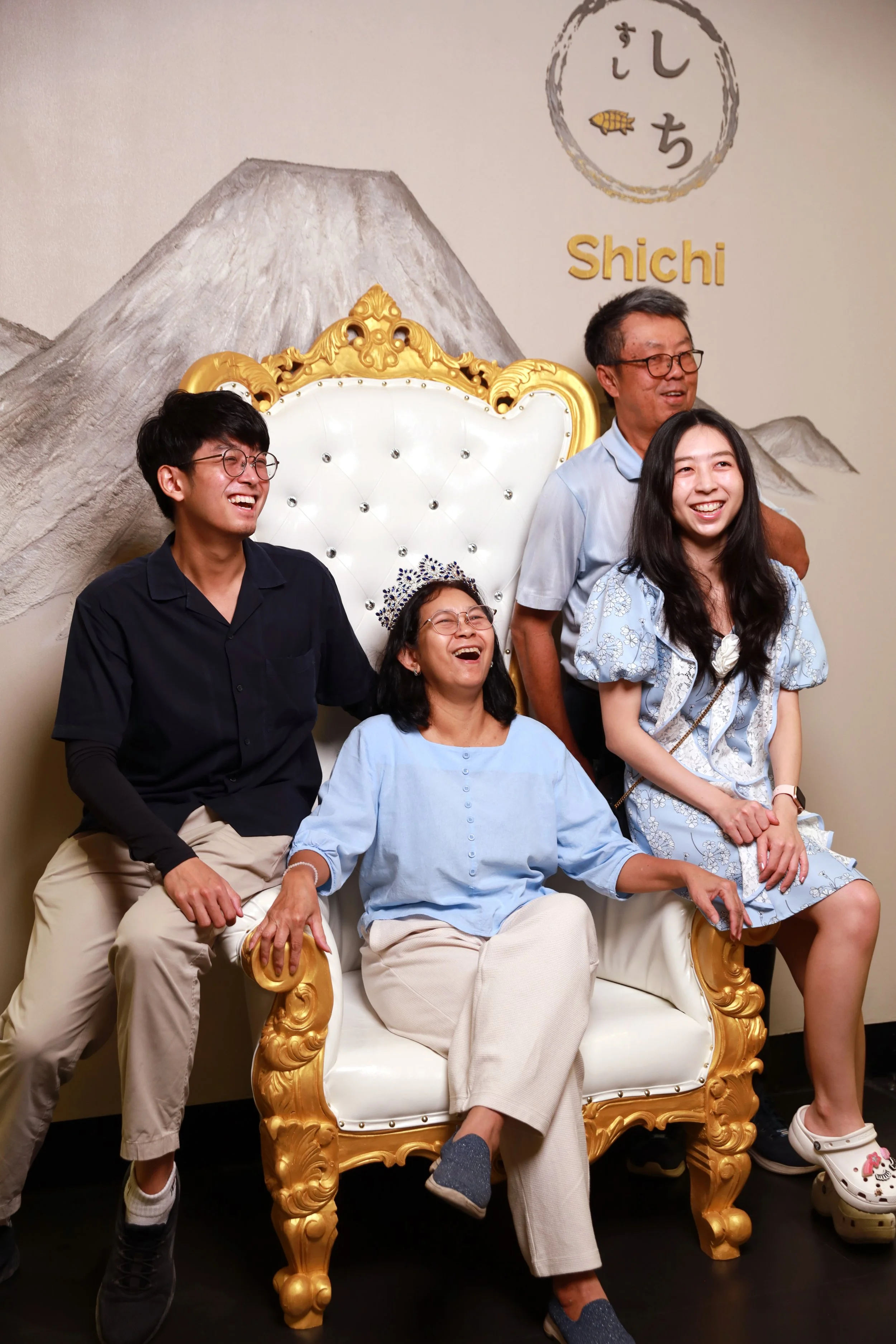
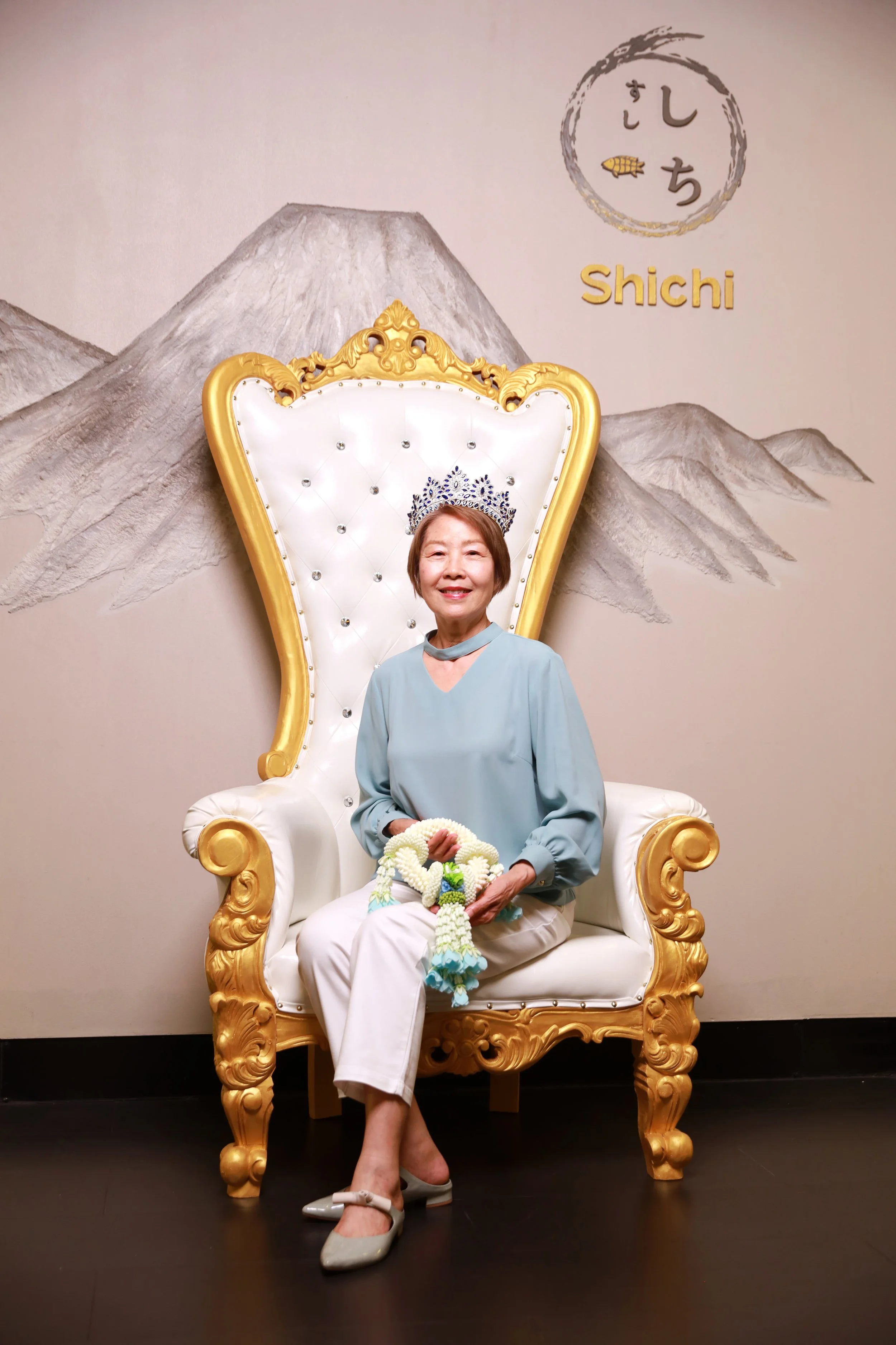
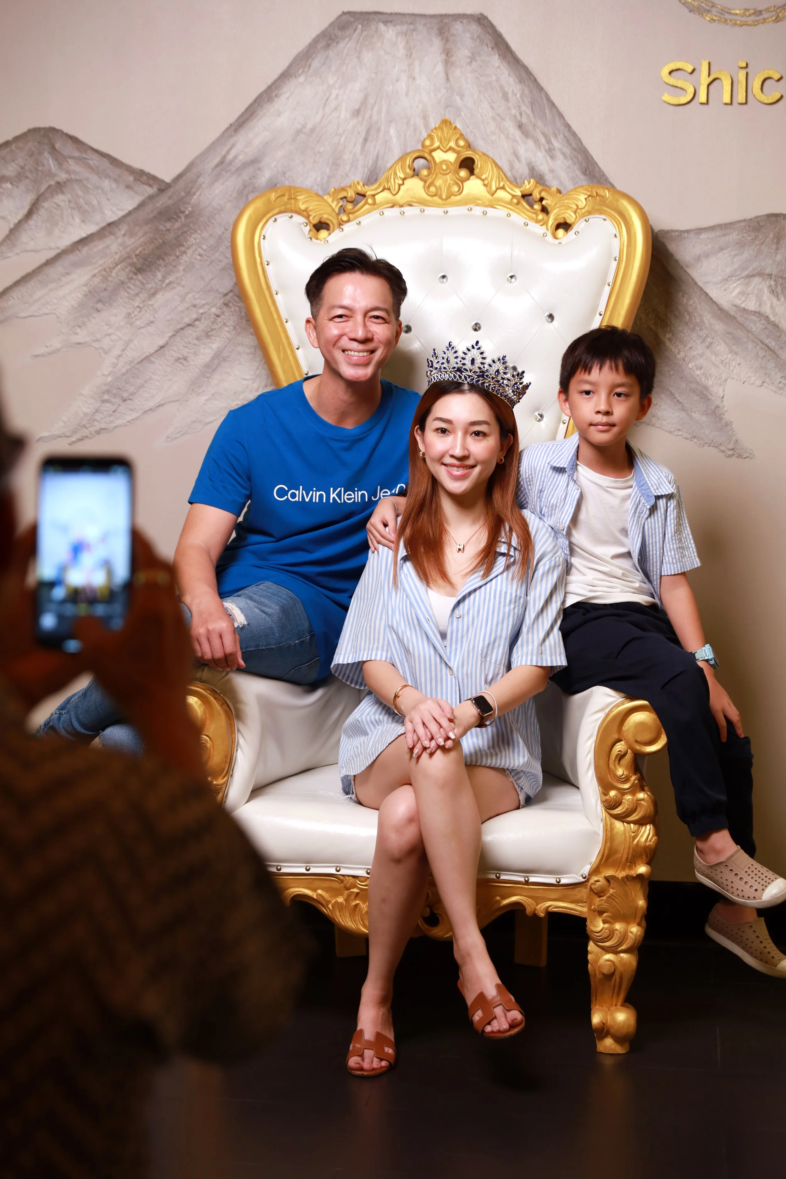
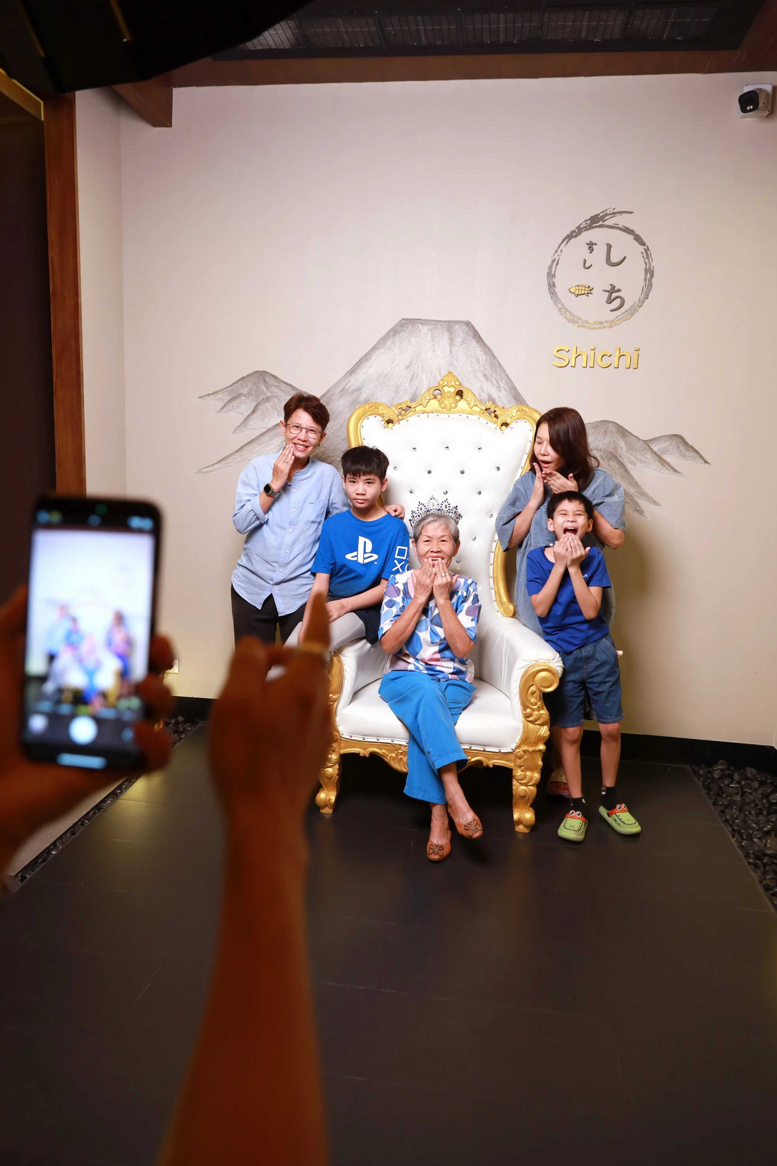
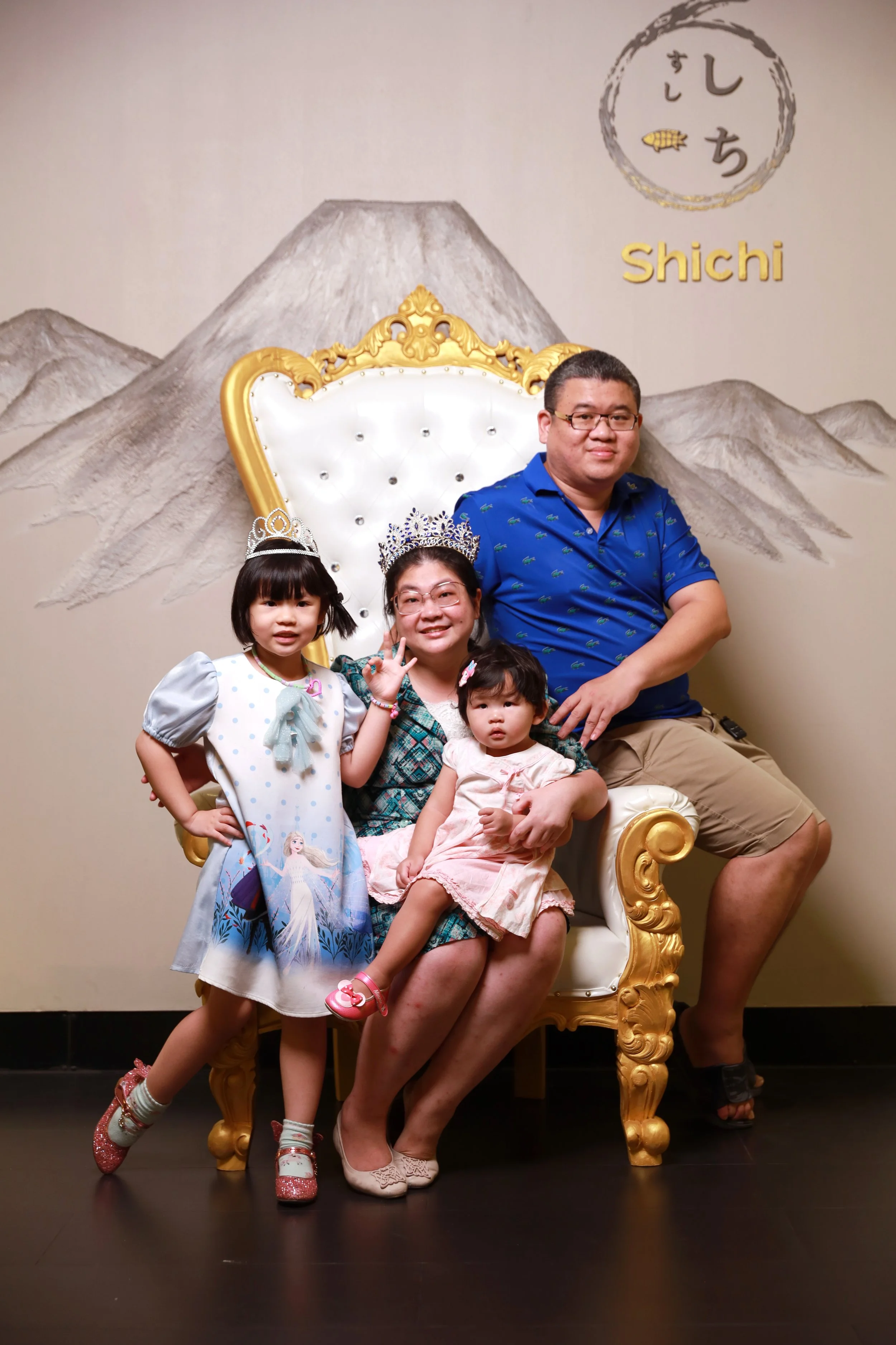
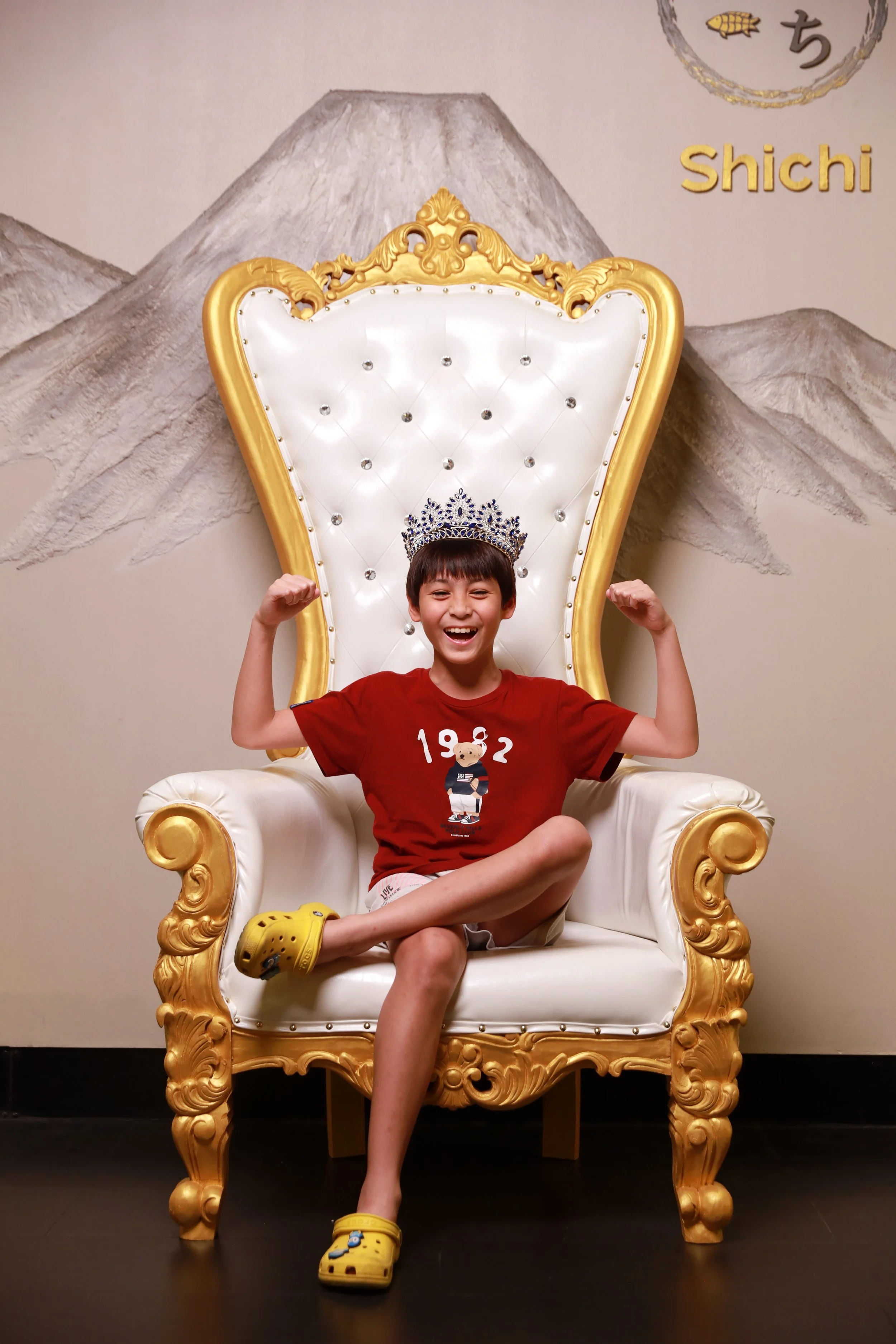
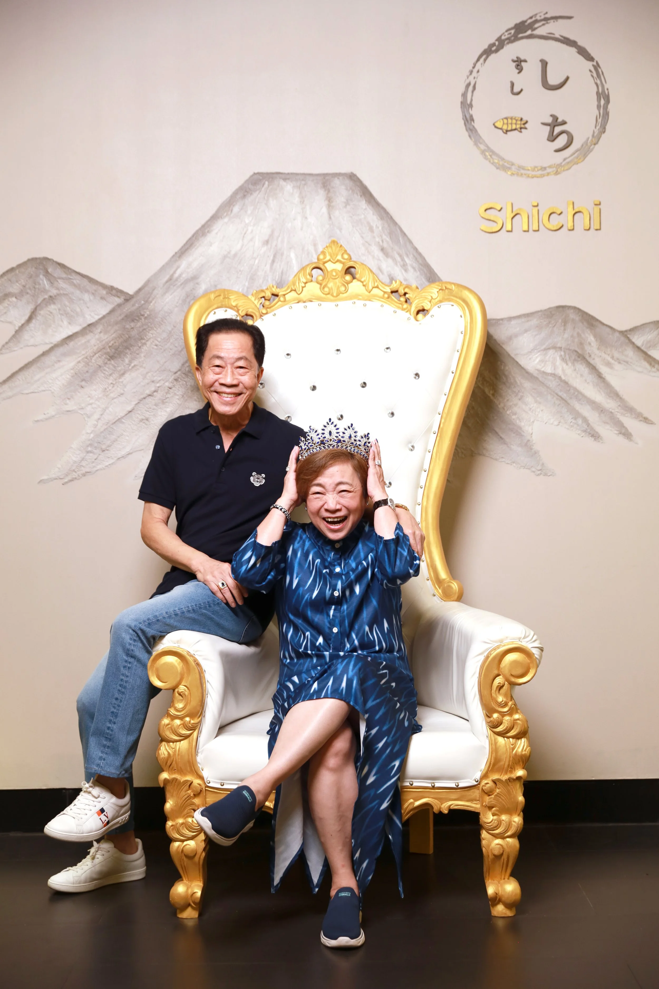
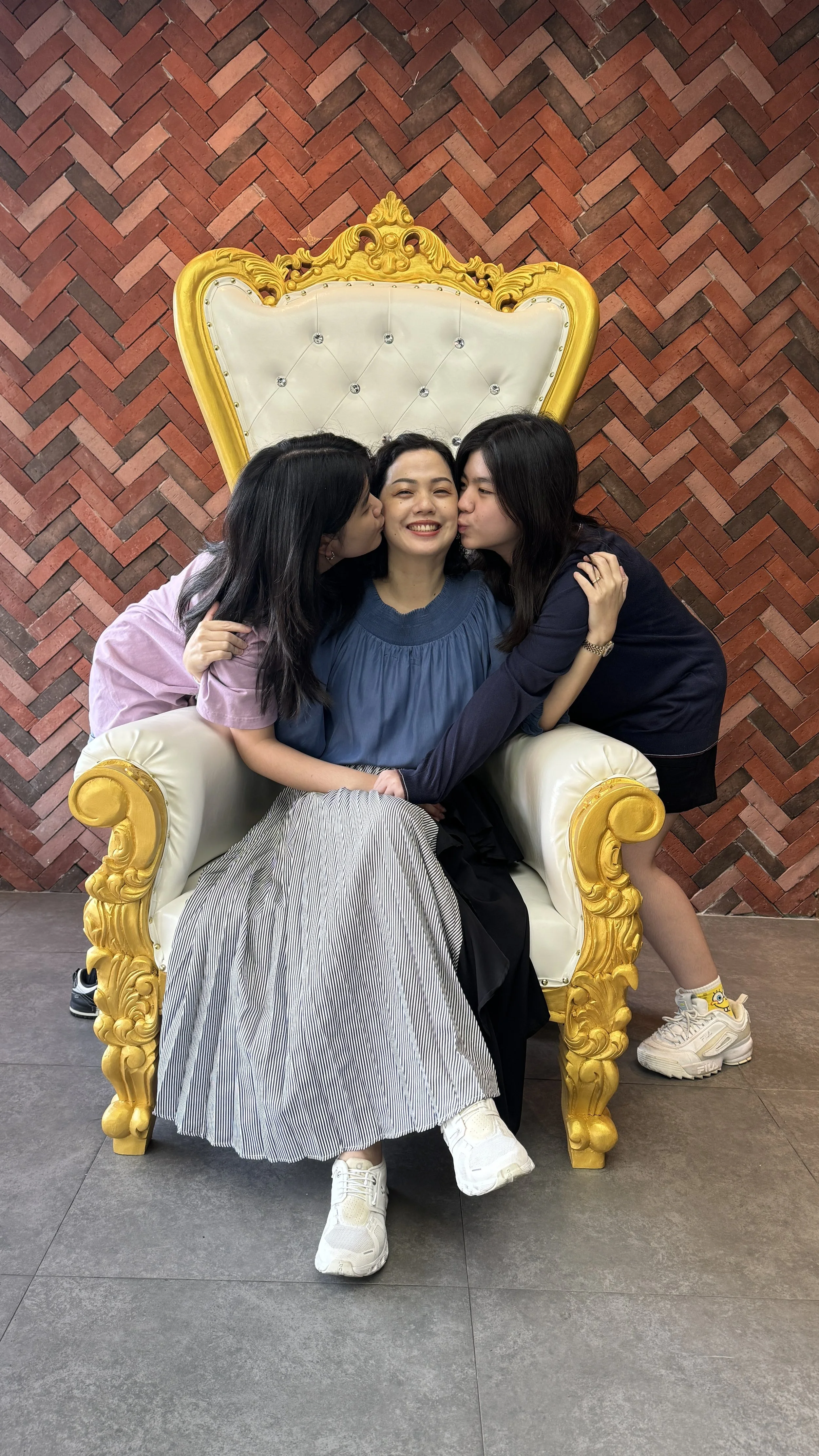
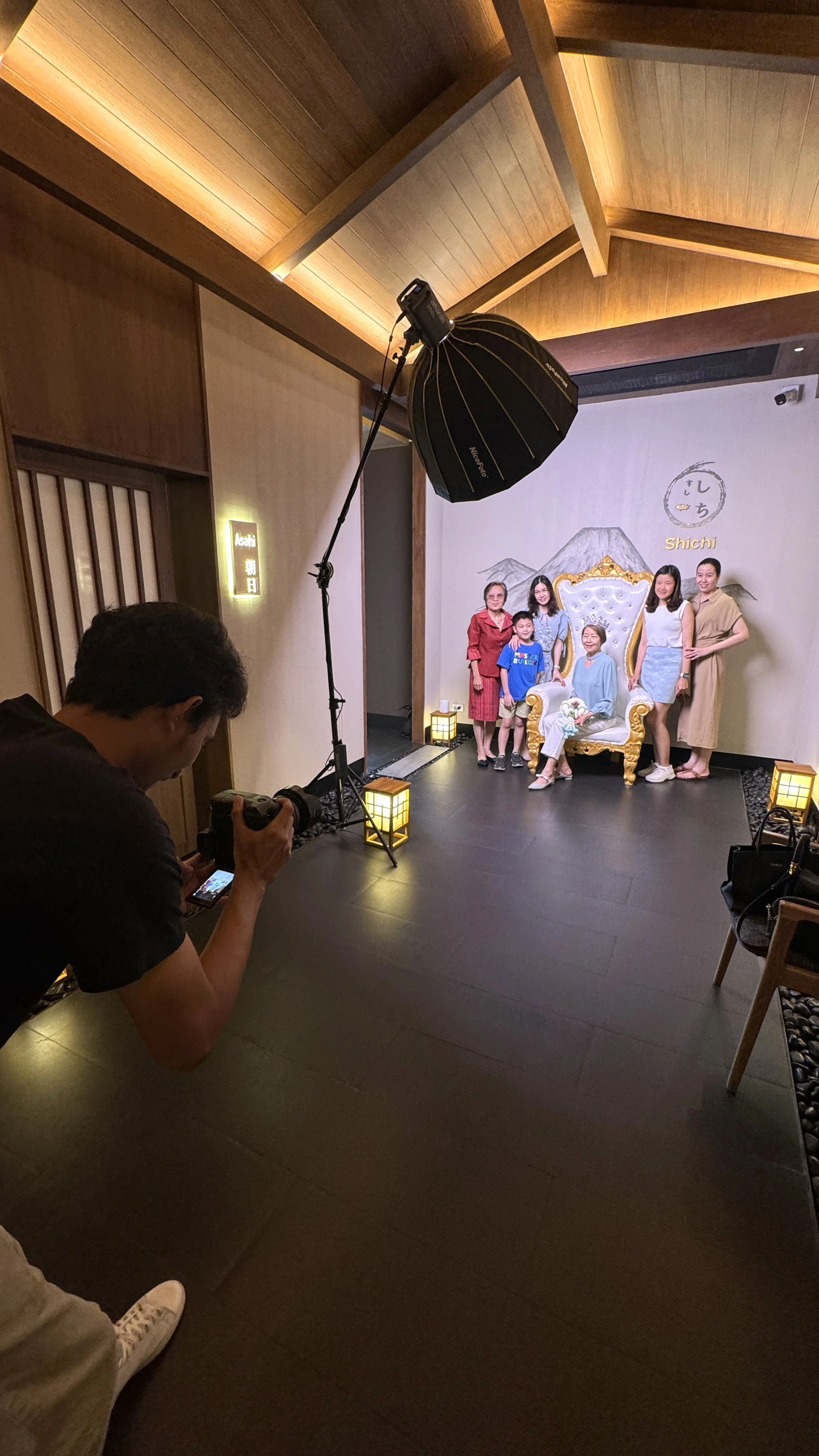
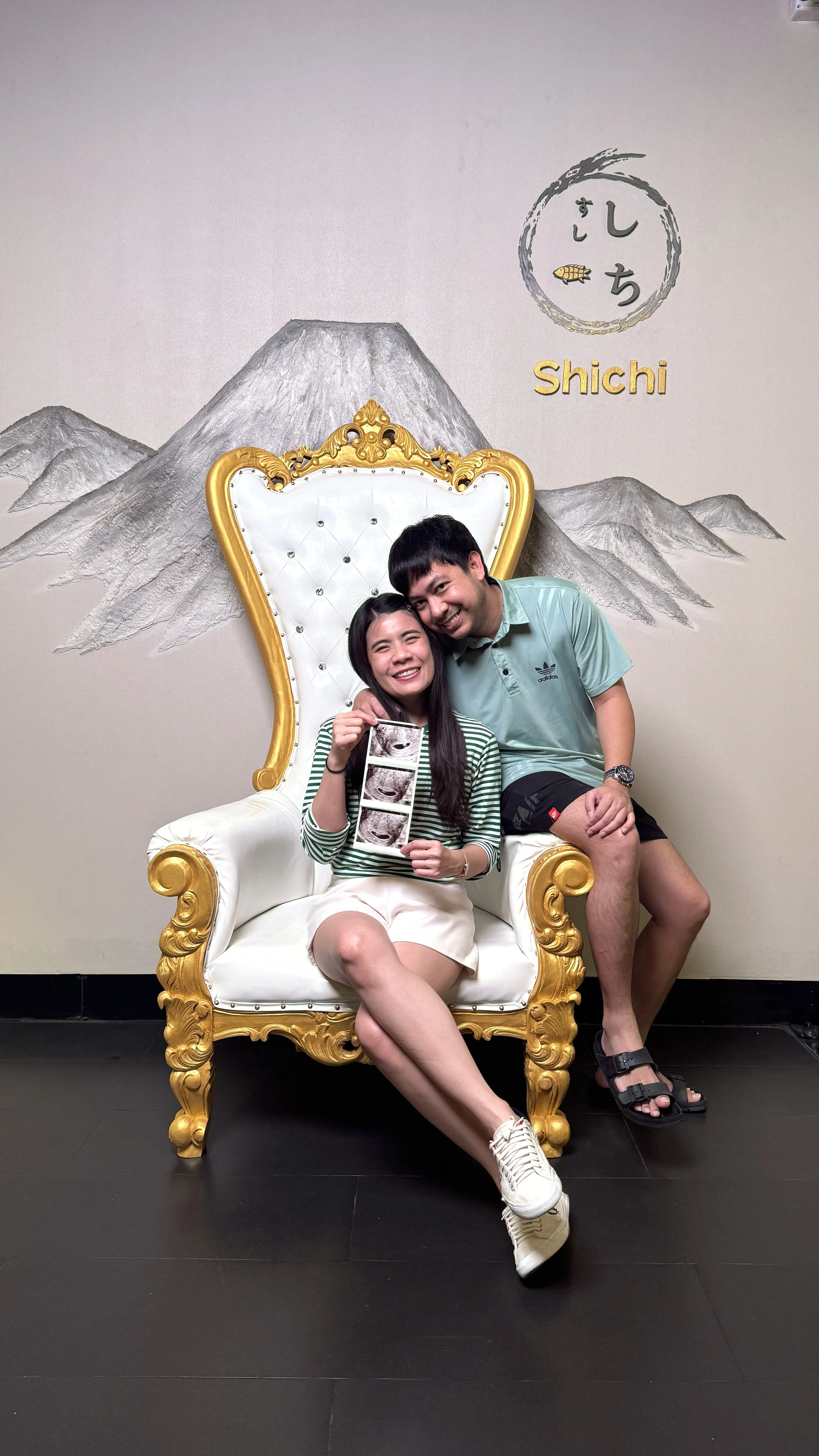
"This launch was the high-water mark. Seeing the staff in the new uniforms genuinely connecting with the guests was the real payoff. It proved that when a strategy is actually embraced, 'Kizuna' isn't just a concept it’s the atmosphere in the room."
A Perspective on the Process
This was a unique project not just because of the distance, but because of the depth of the operational relationship. To lead a transformation from afar, we had to overhaul their internal workflow, introducing tools like Figma and Trello while establishing communication protocols that simply didn’t exist at the time.
But there is a limit to what you can do through a screen. I spent a month on the ground in their world, refining the aesthetic with their graphics team and coaching the social media team to move away from a "copycat" style toward a more authentic, engaging voice.
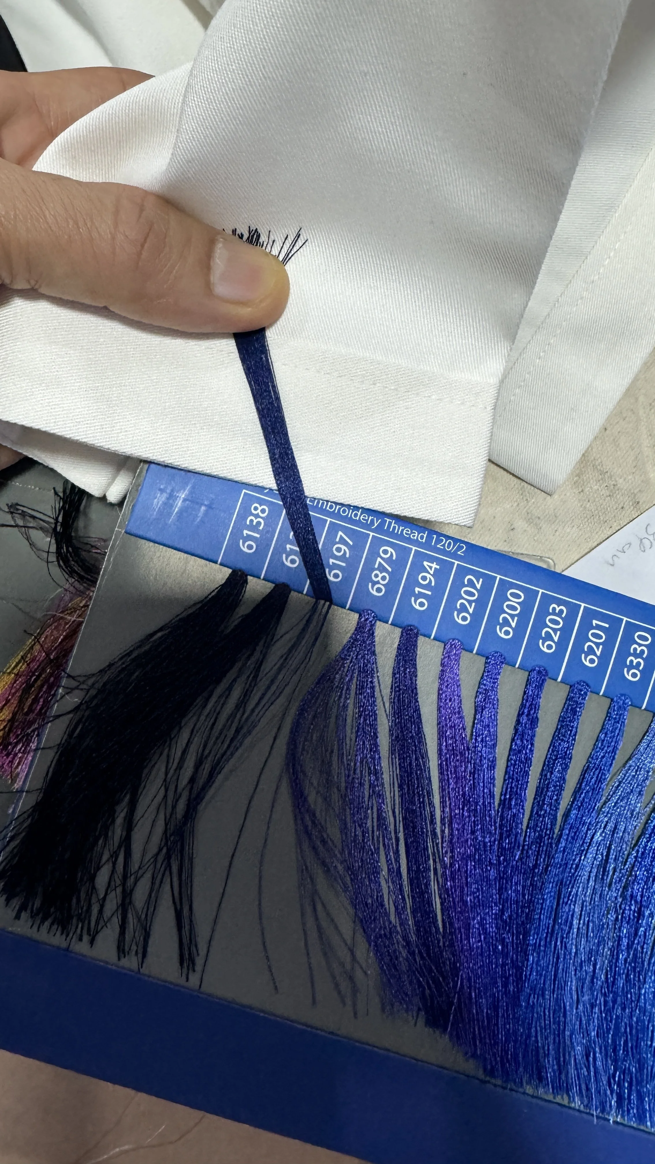
Being on-site also allowed me to work directly with vendors to ensure the physical details met the vision, specifically the fabric weight for the uniforms and the exact paper "tooth" for the menu.
Directing the photo shoot was equally critical; it wasn't just about lighting dishes, but ensuring our new editorial voice was present in every shadow and plate placement. We wanted the menu to feel like a discovery, not just a list.
Overall, the project was a rewarding experience not only because I was able to serve as lead designer and creative director, but because I had the freedom to share my knowledge by mentoring and coaching their developing teams. Watching the strategy finally take shape in their hands was the ultimate proof of concept.
Photography by @Somphoteua